1. PURE PAINTING SERIES

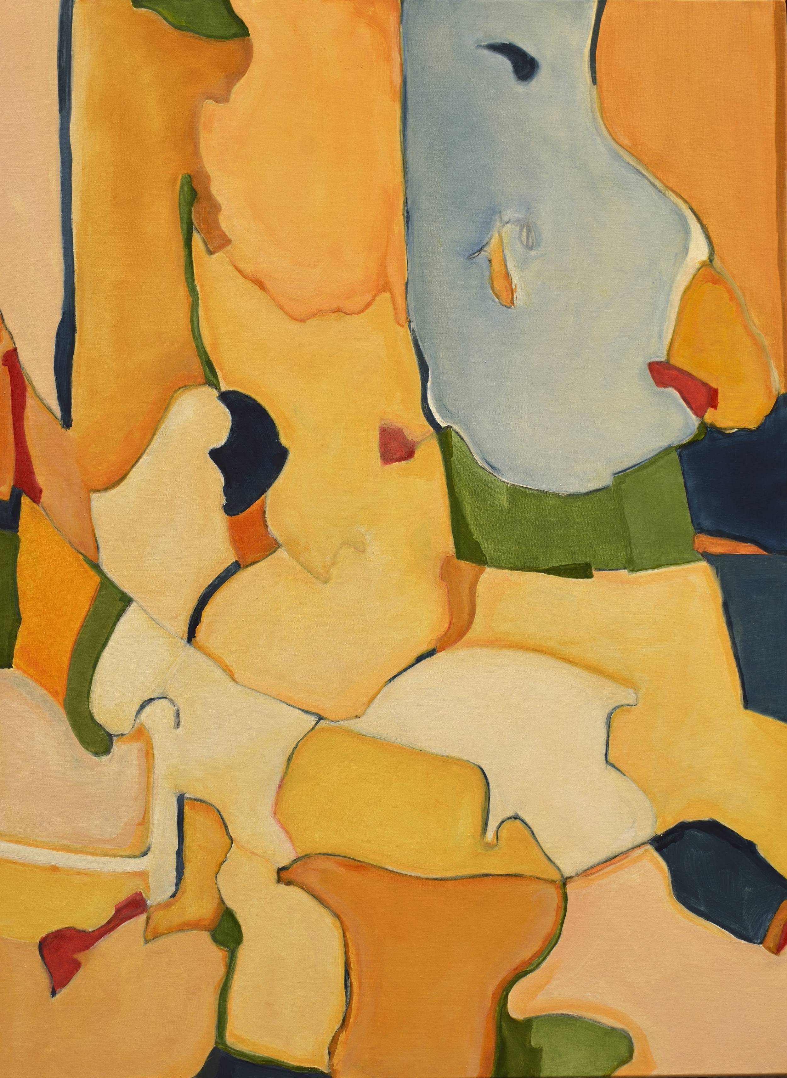
This extended series of paintings started from a simple brush-out of color on a scrap of linen. I was painting abstract nature landscapes at the time and the clarity and directness experienced in making the test strokes registered in my core as the direction that I wanted future paintings to follow since it was in fact establishing it’s own unique nature or existence.

Most of the compositions are based on small oil sketches that serve as source code for the larger formal paintings. Permutations and rotations of the source code sketches generate substantive material for the production of an interrelated series.  Other paintings are constructed in a subtle radial arrangement of rectangular color blocks or wide strokes, similar to paint store brushouts or drawdowns. The paintings remain in a state of flux for a period of observation, reflection and constant readjustment of the colors using glazes to achieve a statement of cohesive disagreement. 

The rectangular shaped elements that comprise the basic vocabulary of the paintings are intended to enhance a clear viewing of the color and are representational of subliminal realities of an organic hand shaped form.  They are not geometrically conceived or constructed. The linear texture and orthogonal weave of the linen support informs the brush and acts as a micro grid and directional guide for form of the color blocks.

The edges of the color blocks produce borders and boundaries that are inherent in the construction of the paintings.  The brushed areas of color are independent and unique. Often the individual color areas are blended to remove the trace of the application tools. This is a desired effect to maintain the borders or color transitions as a critical pictorial element. The chromatic shifts between colors can be abrupt or complementary yielding dynamic associations depending on viewing conditions and light levels

My primary interest is to create a series of Pure Paintings which develop from a directed focus and response to the support, pigments and tools. I am attempting to create paintings that are embedded with a familiar aura or mnemonic coding but are narrative neutral, self contained and free from reference to commercial, social or manufactured influences.

The Pure Paintings are scalable in any size with a 4:5 ratio.

Origin Painting

Origin Painting

2. ACTIVATED CHARCOAL SERIES

Activated Charcoal.10

Activated Charcoal.10

For the paintings produced that concentrated on blocks of color directly brushed and shaped on unprimed linen the act of drawing was absent.

Reintroducing the primary act of primitive mark making through drawing on paper energizes this current series.

The dense meandering lines of coarse vine charcoal explode and blossom when over brushed with oil paint thinned with a generous amount of turpentine generating a dispersal of charcoal particles into the turpentine reduced oil paint and greatly affecting the value of the dominant color; creating an instant chiaroscuro. 

White and transparent paints are affected the most by the charcoal diffusion but the process of establishing a line-based painting is the stronger element in the painting process. Once acceptable forms evolve then the removal or erasure of unwanted dominant line structures produces value changes and depth. Over painting and oil glazes balance the completion of the work.

Similar to the PURE PAINTINGS, the painting alone is the subject/object. However, unintended visual elements have emerged often upon rotation, producing partially recognizable features or objects to some.

The Activated Charcoal Series works are thinned oil paint on Arches Oil Prepared paper mounted on cradled panels. The sizes are mostly 12”x16” and 9”x12”.

3. PAINTED DRAWINGS

The primary act of drawing on paper energizes this current series. The provided structure is an armature that can be transformed into an edge, shape or remain an enhanced linear element.

Dense color blocks are interlocked with transparent amorphous cascading shapes all generated by the initial fugitive vine charcoal marks. The dominance of the line recedes as it is merged with the paint and amplifies the edges of the pictorial elements.

Similar to the PURE PAINTINGS, the painting alone is the subject/object. However, unintended visual elements have emerged, often upon rotation, producing partially recognizable features or objects to some.

These works are thinned oil paint on Arches Oil Prepared paper mounted on cradled panels. The sizes are mostly 12”x16” and 9”x12”.

4. PAINTED BUILDING PLANS

Fifteen years after discontinuing the practice of architecture, building plans have drifted into my paintings.

Thickened lines representing walls and openings, enclosure of spaces and framing of light and views. The metrics of habitation and containment. Addressing the site and placement of buildings and ancillary structures.

Architectural plan elements complicate the effort to seek purity in the paintings. They produce a readable scalable event and a reference to dimensional habitable space. They assign a degree function to paintings which are resigned to being without purpose or actual usefulness.

The suggestion of building plans and site improvements in a non-objective painting directly violated the concept of abstraction in a real and symbolic fashion.

Meanwhile the elements of building plans have entered into my paintings possible as a reference to my previous profession or perhaps as nostalgia for a fading and disappearing mode of communication and construction. WTF.

These works are thinned oil paint on Arches Oil Prepared paper mounted on cradled panels. The sizes are mostly 12”x16” and 9”x12”.

5. MASKbook

A mask is a face removed from a state of personal ownership into an object of public transferable identity. 

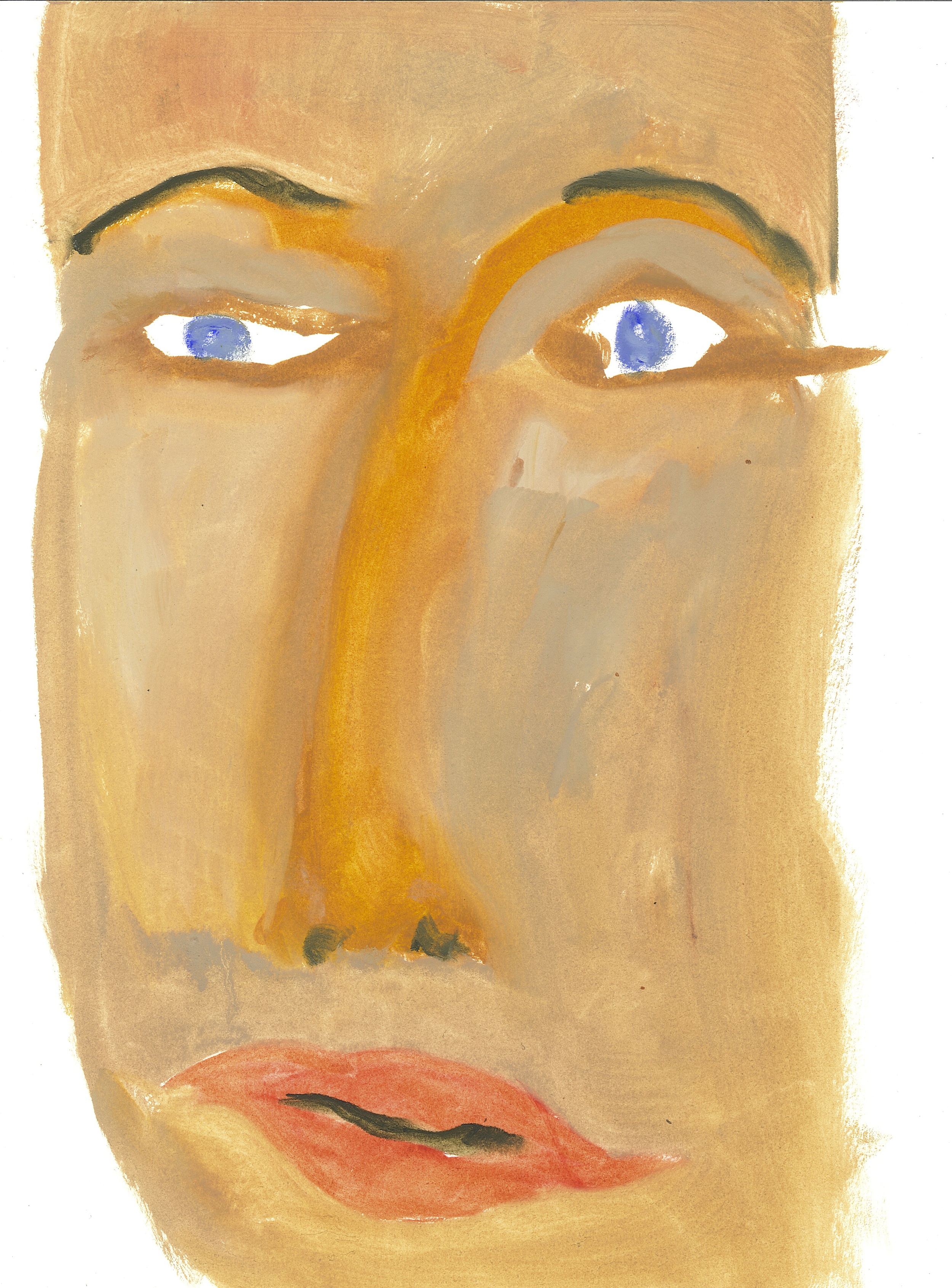
A mask is an assumable face; static and dependable without change or ambiguity. While contemplating the subject of the human face and facial recall I started painting the MASKbook series which included more than 75 images. They were produced at a rate of one a day using the excess paint on my palette while I was cleaning up in the evening. This accounts for some of the colors not usually found in a portrait. The formal issues of painting the face were carefully investigated and reduced to basic head shape, eyes, nose and mouth; the metrics relied upon for analysis by facial recognition software. [see Additional notes below]  There are facial features/elements that are familiar to me randomly embedded across the series, recalled from observing faces over time and sourced from my sub-conscience. I have the opposite condition of prosopagnosia and remember faces well. The series produced some peculiar and awkward faces that only the artist could love.

The more recent MASKbook paintings have the edges of the face flattened and extended out to the edge of the support. This evolved as an investigation into the tension between the oval rounded dimensional qualities of a head and the two dimensional surface, and produces a facial disintegration through distributed features.

The dialectic of surface and detail plays into another dynamic situation: the relationship between the viewer and the painting. With the edge flatness and rectangular format the focus is primarily on the eyes in the painting. Eye to eye contact in a brief stare-down. The painted eyes do not exactly match and the off centered averting gaze causes the viewer to constantly try to at least make contact with one of the rough eyes in the painting. Sometimes this produces a dynamic interchange.

In the mask portraits the mouth is closed and mute almost on the verge of speaking but holding back the true thought or comment or reflection. The viewer of the art work is probably mimicking the same facial positing of their lips since commenting on a work of art especially in white walled gallery is not acceptable or done often.

Humans always are attracted to images representing other humans. They are known from observational behavioral studies to mimic what they observe as a way of empathic response or sign of connection, belonging or affinity. There is also the critical judgment that comes into play: the ranking and establishment of position and social rank.

"People who work in computer animation and robotics often use the term “uncanny valley” to describe a peculiar gulf in human responses to their work.  For example, if you create an animation or a robotic object that appears too realistic, viewers reject it. Make one that’s more obviously fake and they accept it, “flaws” notwithstanding.”-

Jim Campbell, engineer /artist from Square Cylinder review.

Additional notes: MASKbook series

This project began as an outgrowth of a series of PURE paintings consisting of simple color blocks on linen. While processing photographs of the paintings on the computer there was a constant prompting by the photo editing program to identify “faces” using the embedded facial recognition software.  If there was an indication of facial elements in the arrangement of the blocks of color that was suggestive to a computer are they also clues for humans to perceive at a sub-conscience or gestalt level and form a bond or familiarity with the  non-representational art work?

In doing cursory research on the topic of human to human facial recognition it is interesting to discover how much brain activity is required to learn and maintain facial knowledge and recall. An infant will stare for uncomfortably long periods of time to learn a face. The evolving blurred vision is a factor in the focused stare but the infant is absorbing facial aura along with facial features and character marks. Additional investigation into how facial recognition software synthesizes the metrics of a face and applies it through an extensive time consuming and data intensive algorithmic operation the appreciation of the difficult task that an infant attempts immediately after recovering from the trauma of birth.

Becoming aware that there was a potential for the PURE color block painting to project the essence of human facial presence (aura) was something I immediately wanted to investigate in my paintings; determining which combination of color shape, feature arrangement or form evokes a human essence. I have experienced an awareness of advanced pattern recognition abilities all my life but codifying and being able to instill meaningful and a consistent auric response in paintings was different and challenging.

My visual experience has always been internal, incidental and sub-conscience until I analyze it and bring it into my fore-conscience through drawing and painting.  

6. Watercolors/GRIDS

The origins of the architectural watercolors were simple grids lightly drawn with a 9H hard lead pencil on Arches text paper. The rectangular shapes were carefully and deliberately painted in with dry brushed watercolor paint. Over time, diagonal lines bisected some of the squares and the suggestion of a simple house form developed. During this time, Master’s Thesis work in Architecture and an independent study of "the thinking eye" and "the nature of nature" by Paul Klee greatly influenced the paintings. A six-month trip to Europe to study architectural space and ornamentation quickly brought the paintings into focus as clearly architectural studies with the grid/support structure reduced in importance. As the scaffolding was gradually removed from the paintings the buildings became the subject; primarily as flat facades or in a pre-perspective style influenced by medieval painting and Ikons.

Between trips to Europe inspiration was maintained through vintage photographs (Robert McPherson, Alinari Brothers, Francis Frith) and antique books/architectural portfolios and the many b+w photographs taken during the trips. As the immediate travel inspired memories of the specific architecturally significant buildings and details of construction dimmed and an internal back-up memory took over.

An entire vocabulary of architectural bits and pieces, spaces and locations, seamlessly flowed from the end of the pencil. The less thought and effort that went into the base/outline drawing, the more original and special the outcome. There was a vast reservoir of images to draw upon and an unknowable force that assembled them on the page; free from conceptual thought and learned designed interference and outside prejudice. If the paper was placed on the table and the pencil was placed in the right location the drawing would appear.

Like the grid drawings of previous years, the building drawings maintained a system of integrated closed cell shapes. Possible similar to a child’s coloring book. The drawings would be painted as a separate and independent act that was equally automated by the long period of learning colors, mixing and brush manipulation. The painting of simple grids, devoid of image or identifiable shapes (buildings) created a memory path that was integrated in the subject based paintings.

The painting of the closed cell shapes was a long-term project and it was independent from the accurate or realistic description of the building. Some paintings have hundreds of cells and each one had the color individidually considered, mixed or shaded prior to application requiring many days to complete even a very small work.

The grid or matrix has been the foundation for most of my paintings over the years. The grid is the primary generative source and also the default position for restarting painting after a completed artistic investigation or after exhausting my creative intelligence.

7. Abstract Landscapes

Landscape Paintings - Draft Copy/written 11/06/04

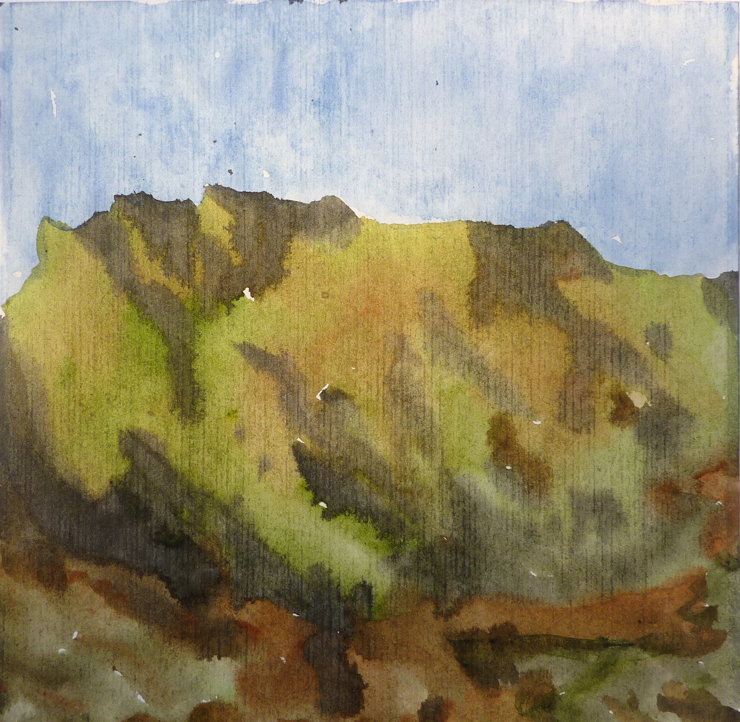
The abstract landscapes using Chinese brushes are a combination of sumi ink and watercolor. They reflect my interest in traditional Chinese painting, the force and energy (Chi) represented by mountain and natural earth formations and the relationship of human spirituality and the natural environment. The recently published translation of the 1831 text "Nine letters on Landscape Paintings" by Carl Gustav Carus (The Getty Research Institute-2003) has been a guide in formulating my artistic direction. Carus was a Philosopher, Medical Doctor and painter who was a component of German Romantic Philosophy movement which strove to identify the connection between the natural world and the soul of humans. They were reaction to the beginning of the industrial age and the separation and isolation of man from nature through the introduction of non-agrarian life. Carus proposed that the soul was present in the cell and as it divided upon fertilization the soul was present in each division. Following this thought, every cell has a soul element and all of natural life is connected with it.

The essay entitled “Nine Letters on Landscape Painting” has been of special interest to me since I paint from an interior experience that is informed by natural observation and knowledge. The large and crude brush strokes of the landscapes represent the mass of the mountain form (gestalt) and they representing the creating forces (chi) that created the earth in geological time. The brush gestures make reference to the fingerprints of God that the German Romantic philosophers felt were present in the creation and maintenance of the natural world. The watercolor inter-painting (between the strokes) represents the temporal forces of trees and vegetation, animal life and erosion triggered changes in the mountain surface.  The energy spent walking up and down the mountain and the views enjoyed and the natural phenomena observed inform the watercolor choices and brush hesitations, forming pools and eddies of intensity of color and brush strokes. In an attempt to draw out the unconscious experience of the observed mountain walk, a pathway is opened and the brush takes direct communication from the mind and the eye constantly adjusts the drawing process. The images are gathered in the eye’s peripheral vision and enter memory as unfiltered ray of spirit (chi) and energy.

The brush marks/gestures are a record and represent a calligraphic interpretation of a natural language made up of a vocabulary informed by segments oak tree, the outlines of the ridge against the sky or the random appearing rivulets in the trail fashioned by recent rains. The visual language produced is not read but understood. The message is energy and growth, atrophy and decay: the cycles of nature, the balance and harmony of life. To be interest in remembering a certain place in nature, an attracting “ether” must be present. A special golden light or dramatically dark sky might become the catalyst to make the presence felt in a natural place. All the world can be qualified as being of nature or natural but augmentation by elements of perceived beauty, absence of interruption by human progress, or spiritual embodiment (as a sanctuary) reclassify certain natural zones as memorable and become teachers of the essence of existence.

We learn from our environment, and often the lessons we choose to influence us are that nature is a silent victim to our progress. Relocation is the preferred solution to the ruination of the natural world, there is no solace in manufactured nature, a simple creek bed can take years to reconstruct into anything close to its original function and physical presence.

I painted the landscapes daily as part of my meditation on the natural world often after a long walk in the Claremont Preserve and the hills above the Berkeley campus.

Afterword: These loosely painted sumi-ink/watercolor sketches are an immediate and pre-conceptual communication with observed and remembered natural formations and phenomena. The study of Chinese landscape paintings, Taoist writings, travel in Japan and China, and time spent in Kauai and the Sierra Nevada mountains provided a continual source of inspiration. In addition to mountain studies I painted an extended series of "Meadow Studies" inspired by our meadow at Sea Ranch. This body of work produced from 2002 to 2009 includes more that 500 painting on paper. 

8. Oil Paintings

After being watercolor painter for over 35 years I started exploring painting with oil after viewing the Gerhard Richter exhibit at SFMOMA (2002). I have no stylistic connection with his work but upon carefully observing his masterful use of oil paint I realize that I needed to change medium in order to increase the scale, presence and viability of my work if I was going to move forward and grow as a painter.  It was a surprisingly difficult transition with all of my initial goals of simply translating my watercolors into oil paintings largely un-realizable. I did however develop an unrelated direction that hopefully has the potential to produce substantive paintings.

The larger paintings are oil paint on stretched linen primed with a lead oil ground. The standard size is 30” x 40”. They are often painted on a parallel time frame as the oil on paper series and  share the same colors and formal concerns.


9. A Private Architecture

The Ascent of Architecture-w.c./gold leaf/india ink 1985

The Invention of an Architectural World

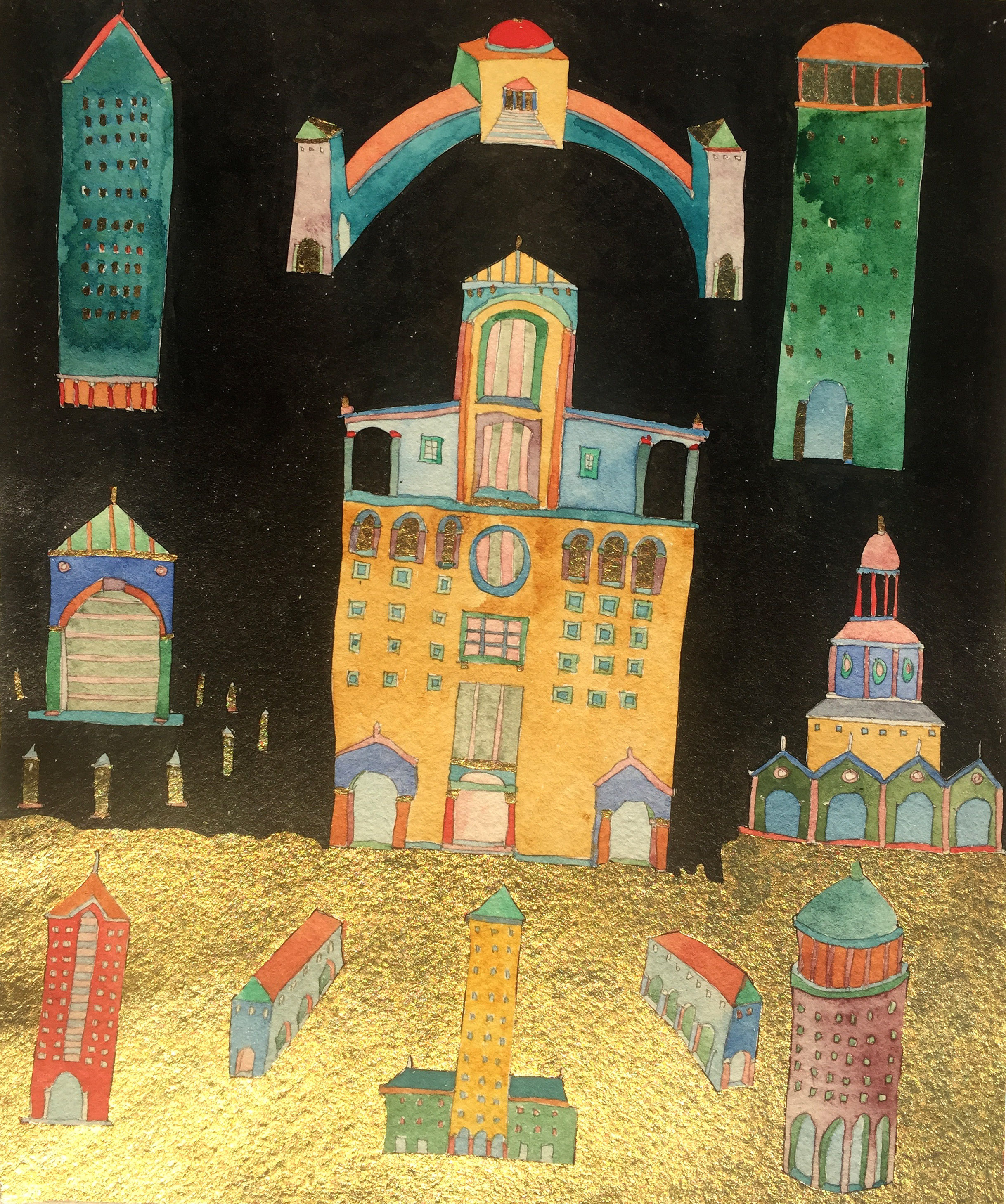
Keith Wilson's early paintings are icons; they are dedicated to an architecture that is no longer conceived or constructed.  They also represent his continuous study of architectural form and the history of the place of buildings in paintings.  He uses building structures and details in juxtaposition, allowing classical elements and vernacular constructions to reveal themselves, proliferating variations.  His color is similarly the product of memory, imagination, and intuitive application inspired by the painted buildings observed in Italy and Greece.

Gold leaf was often employed as an integral element of the work and not a decorative flourish; it is an homage and direct connection with ikons and medieval religious painting which he has studied and revered.

Black India ink on the watercolors represents an absolute (duende) force in contraposition to the spiritual and ephemeral characteristic of the gold leaf. This yin/yang relationship or dynamic occurs in addition to the narrative of the brilliant colors and the architectural/spatial forms: infusing the paintings with the powers of the heavens and the earth.

The result of this artistic exploration is a body of over a thousand paintings and drawings in which memory of historic form, fantasies of buildings that might be, and studies for commissioned works are all intermixed. The first exhibition of this work in this genre was in 1979 at The Philippe Bonnafont Gallery in North Beach.

This fusion of personal vision, fantasy and architectural devotion, with the serious study and knowledge of architecture is more than an artist’s personal vocabulary.  It is also the expression of a designer’s effort to resurrect a spirit of mischievousness and invention long out of favor in the architectural profession. The body of work represents a parallel architectural practice which was interdependent and supplemental to the work he designed for firms and clients.

The early grid paintings gradually evolved into building blocks and recognizable architectural forms then they were quite popular among an architectural audience around the UC Berkeley school of architecture and a SF North Beach art gallery which specialized in exhibiting architectural drawings and paintings, the Phillippe Bonnafont Gallery. There was a economic depression around 1980 when he graduated and architects world wide turned to drawing and painting since there was no chance of building anything or even getting a job. Traditional drawing skills were rediscovered and were developed, historic architecture was uncovered and plundered for shape and style. The sad result was an unfortunate Post Modernism style that followed Modernism and the International Style.

Wilson exhibited the invented architectural  watercolors  to architectural audiences over the years but did not actively pursue gallery representation of the large body of work after the Bonnafont gallery closed in the late 1980’s. There was a spirit of the age encapsulated in that period that will not return. This architecturally focused work was primarily produced between 1978 and 1995. The tall buildings were part of a series of "the Skyscraper Artistically Re-Considered" paintings and reflect on his time in the Building Design Department of SOM Architects, SF in the mid- 1980's. A renewed interest in painting of invented architecture developed between 2002 and 2006 after purchasing a large William Wurster house in Berkeley and restoring it with his Architect wife. This focus was discontinued when an in-depth interest in Chinese painting, Daoism and the natural world developed.

The artist’s purpose in limiting his painted works to such an intimate scale was to invite close scrutiny, limit distractions, intensifying involvement of the viewer’s imagination with the with the work. Once associated primarily with Persian Miniatures, hand printed photos and etchings this intimate focal distance is once again commonplace with the current reliance on tablet devices and phone displays.

Keith Wilson was born in 1954 in Redding, California and has lived in the Bay Area since 1972. He received his BA in Architecture and M.Arch from UC Berkeley and has traveled extensively in Britain, Europe, Japan , China, Chile and Tunisia with his sketchbook & camera.   

As an Architect he worked at Skidmore Owings and Merrill, SMWM, Hannum Associates and was a partner with his wife Jessica Seaton, at Seaton/Wilson Architects, Inc. He currently resides in Marin and The Sea Ranch practicing oil painting.

Archival Prints of the  some of the early Architectural watercolors may be viewed at: www.KeithWilsonArt.com

"These imaginary buildings and garden spaces would not exist if I did not document them in my watercolors and drawings. They are constructed first as detailed line drawings and then painted with watercolor to bring life to the forms and create depth. The laws of perspective do not permit looking around corners and seeing the roof and the floor simultaneously, so I ignore the laws and paint the way I experience my collective memory of the great architecture, anonymous structures and civic spaces that I have visited. The scale and fine detail of the paintings encourage close-up viewing in order to encounter the infinite yet intimate space represented."

KEITH WILSON- 1983

HELLO, I AM A PAINTING...

GREEN SQUARES OPPOSED lr-low.jpg

and since traditional paintings usually cannot communicate with words or speech I am reliant on this text to make you aware of a few elemental aspects concerning your further evaluation and appreciation.

:: As a viewer you already know everything possible about me, just don’t think about it because then you question your own exact and intuitive observation.

:: I have a name: GREEN SQUARES OPPOSED. This does not imply a conflict or rupture in the complacent order of the composition but it (the position of the small corner located green squares) does set off a contra-positional rotation and stretches your eyes a bit. If it was more pronounced it would be noticed with out mentioning it but your inner eye was aware of it immediately

:: As a painting I am kinda, well one dimensional, as in flat. Any illusion of depth is really an illusion. Just trying to be honest.

:: I exist because I exist. This is not a philosophical statement just a fact. There are no associated images that I represent and no allusions implied or sublimely suggested. I like it this way since as a free agent I can be self-represented and am not dependant upon association. However, I realize that I should not try to be philosophical since it tends to become circular, like a snake chasing it’s tail.

:: Being too small to command a prime spot over a sofa or decorate a room, I am a portable reminder of observation and remembrances; an ikon-like tableau of humble material collected on a mounted linen rag nailed to a pine box.

:: Free from association with objects from the physical world I share my space as one of the objects being one, not of the multitude.

:: Some Russian guy [note1] said, “Suprematism is the rediscovery of pure art which, in the course of time, had become obscured by the accumulation of “things.” This might sound radical but the point is that pure art has the potential to exist when sentimentality is suspended and the process, materials and tools of art creation are given a dominant position.

:: As in physics, everything occupies its own space and can not preempt with out exerting energy or force.[note2] There is energy pushing the colors on my surface, it is demonstrated by the way the paint flows over the edges and by the force fields that contain the blocks of color in a friendly but pushy way. The equilibrium/stasis of a crowd trying to be polite but also get on a packed subway car.

:: The physical properties of color define relationships of power exertion, transfer and assimilation (incorporation, absorption, digestion) these are expressed in dominate and submissive forces and this high-tension field is put into balance until the lights are turned off and then all chaos breaks loose. This is from The Secret Life of Paintings, chapter 37.

:: If you are color blind, you have my sincere sympathy; this painting is about the inter-reaction of color. Just keep in mind that there are birds in Peru that share some of these colors in their feathers but it does not help them fly any better. Their structure, muscles and their form do the work.

:: Speaking of color, all theories are ignored. Complying with too many rules destroys fractal energy. Color is simply color and sometimes mixing too many beautiful expensive pigments together makes an awful gray sludge.

:: Inherently I exist as an object. While being narrative neutral in subject, it does not imply that I am anonymous and with out an origin/creation myth.

:: A structural analysis would reveal that the bi-directional intersection of the warp and the weft the linen support informed the stiff boar bristles of a brush depositing a mixture of rare earth and minerals bound together with very refined linseed oil [note3] into roughly rectangular shapes. The brush held by an eye/mind-guided hand subject to constant calibration and correction, and contemplating life experiences, the natural and artificial world and what to cook for dinner.

:: Oh, by the way, there is a small piece of lettuce on your tooth.                                Since we are friends I though I could tell you that. I am sure you would do the same for me.

:: Now that we have had this conversation I would like to come to your home [note4] and look at your paintings. Just don’t turn the lights off, I am afraid of the dark ie. chaos and all that!!

NOTES:

1.      Kazimir Malevich also said: “The square is not a subconscious form. It is the creation of intuitive reason. The face of the new art. The square is a living, regal infant. The first step of pure creation in art. Before it there were naive distortions and copies of nature.”

2.      Albert Einstein had developed theories on this but since he was not a painter it is only relatively accurate. 

3.      Linseed oil is expressed from the seeds of the flax plant, the fiber in linen.

4.      This actual painting is not for sale but you are welcome to take it home for a visit, just leave your visa card at the counter.