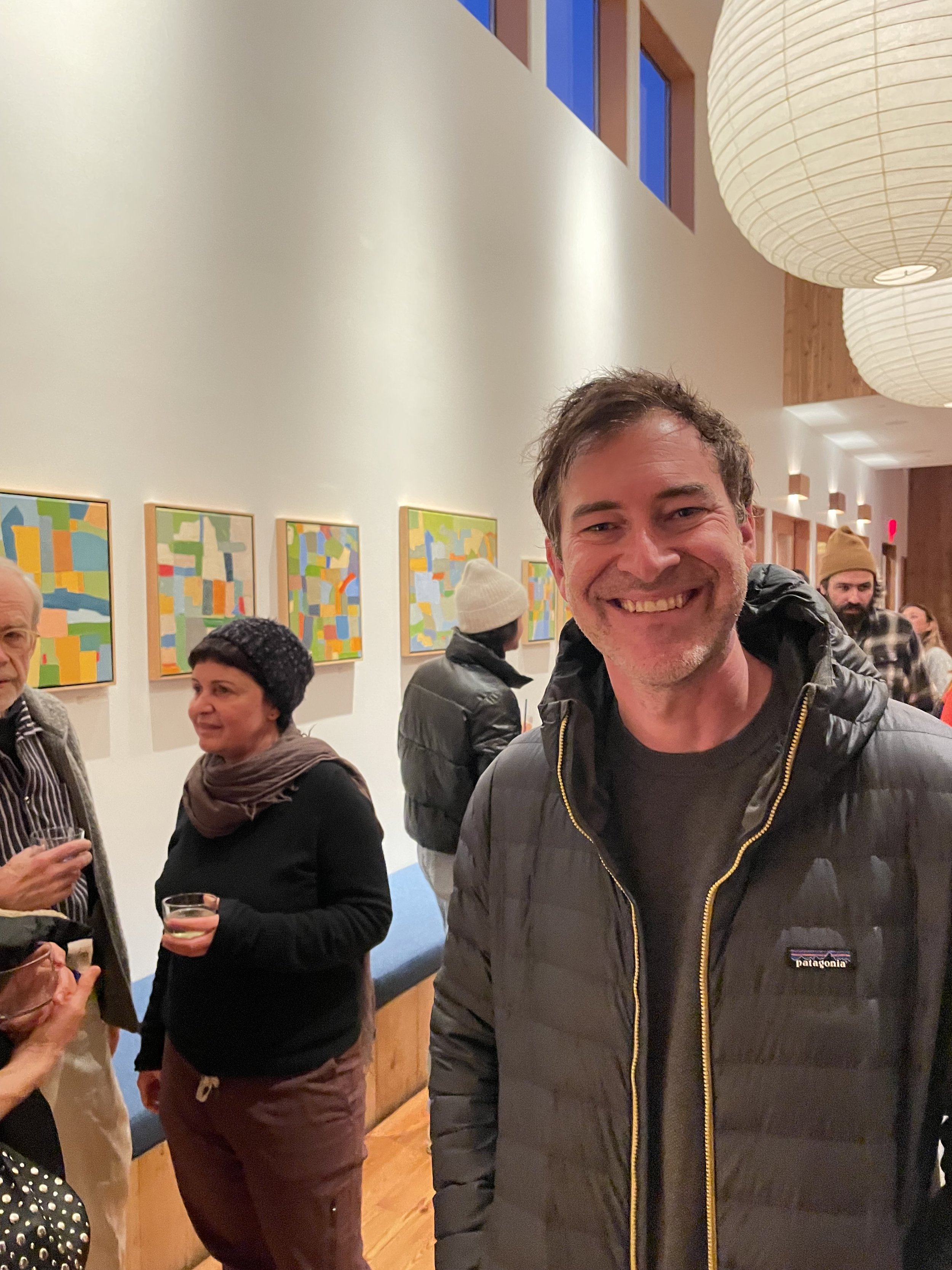
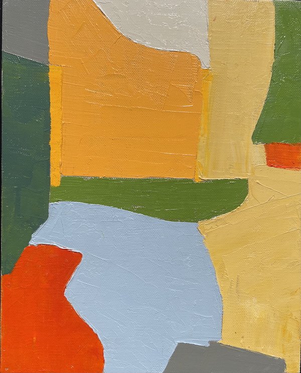
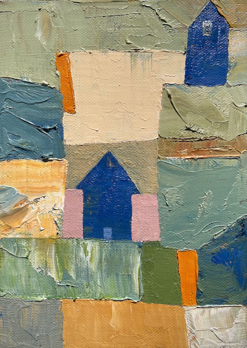
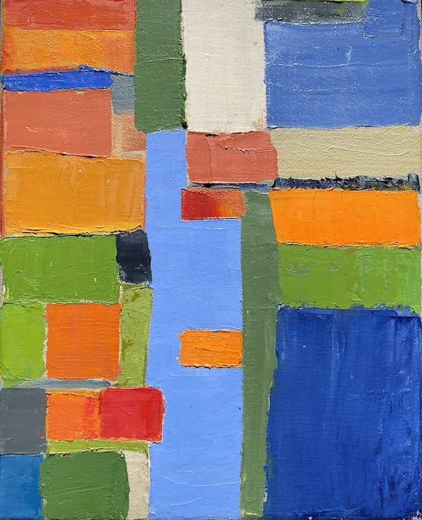
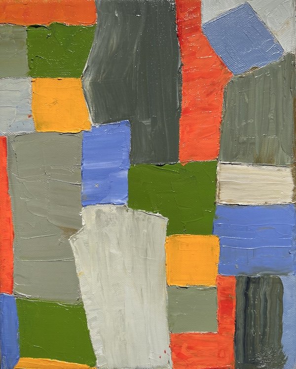
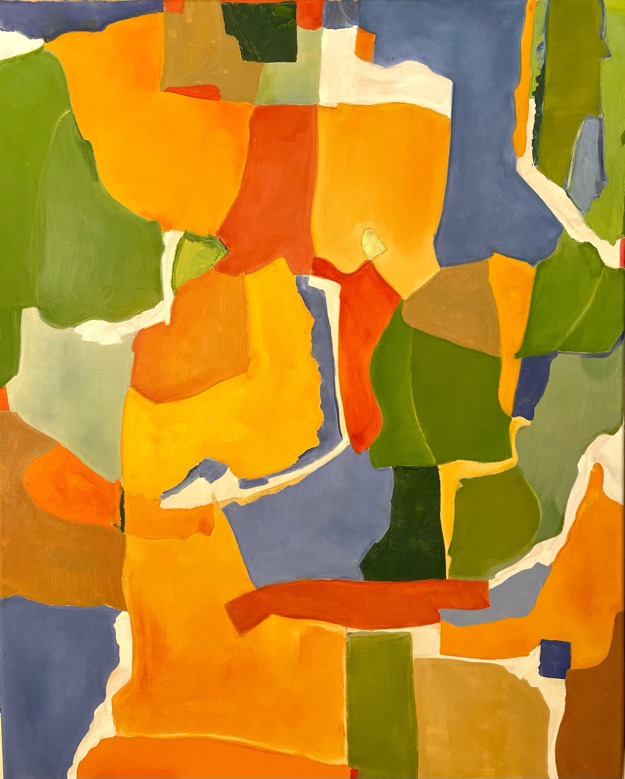
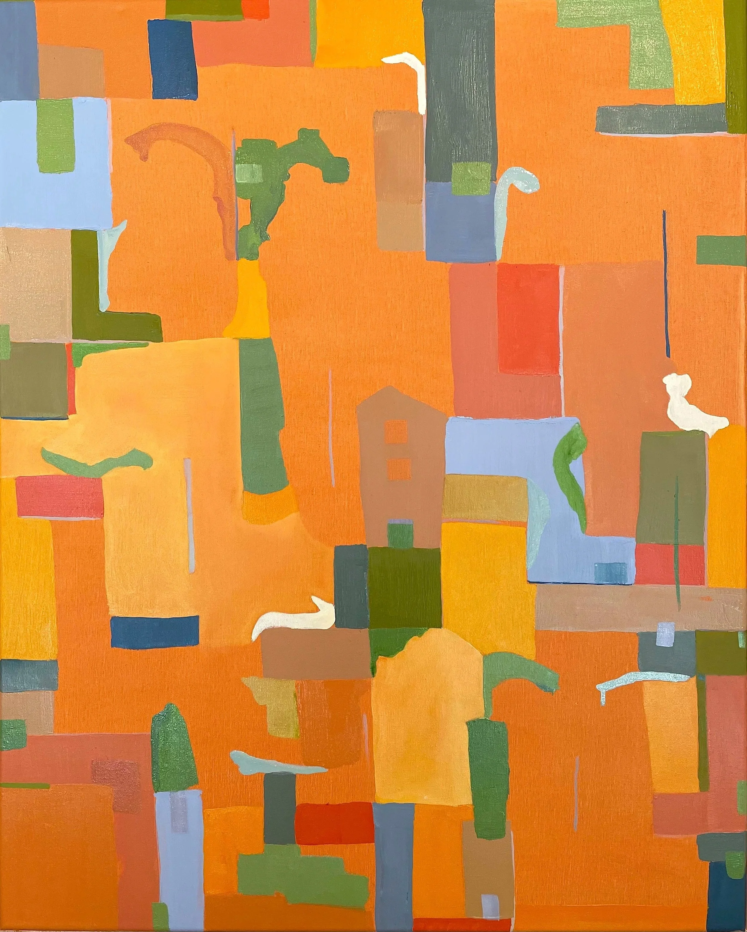
THE SHAPE OF COLOR, SOLO EXHIBIT AT THE SEA RANCH LODGE JAN 4-FEB 28 2024
The North Coast area provides an artist with a multitude of inspirational natural resources to use as painting subjects. However, I find that it inspires me to explore more abstracted relationships between colors, organic lines, irregular shapes and blocks.
In my experience, nature is best revealed and appreciated by viewing it as a dynamic living experience. The resultant takeaway is a memo of light and wind and fog on the rocks and forests that I reference consistently to generate oil paintings that hopefully will enliven homes and enrich the occupants when the natural world is out of reach or access is restricted by weather or darkness.
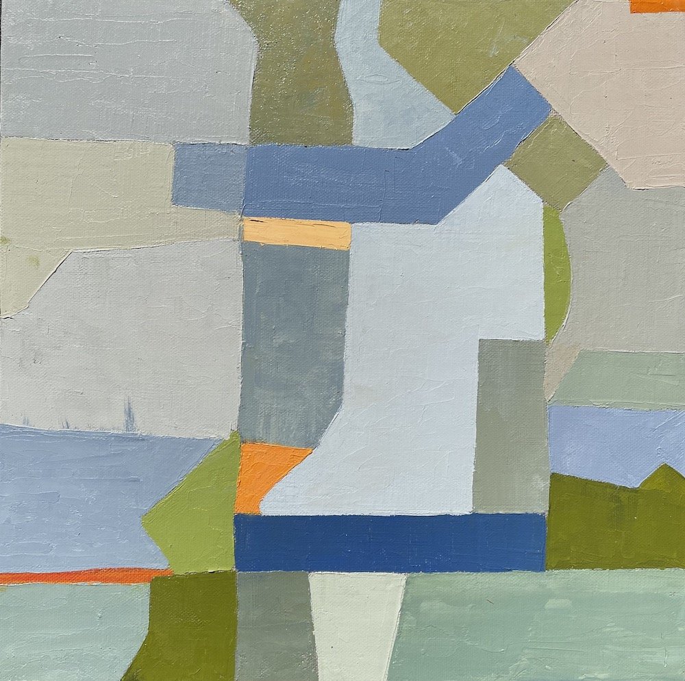
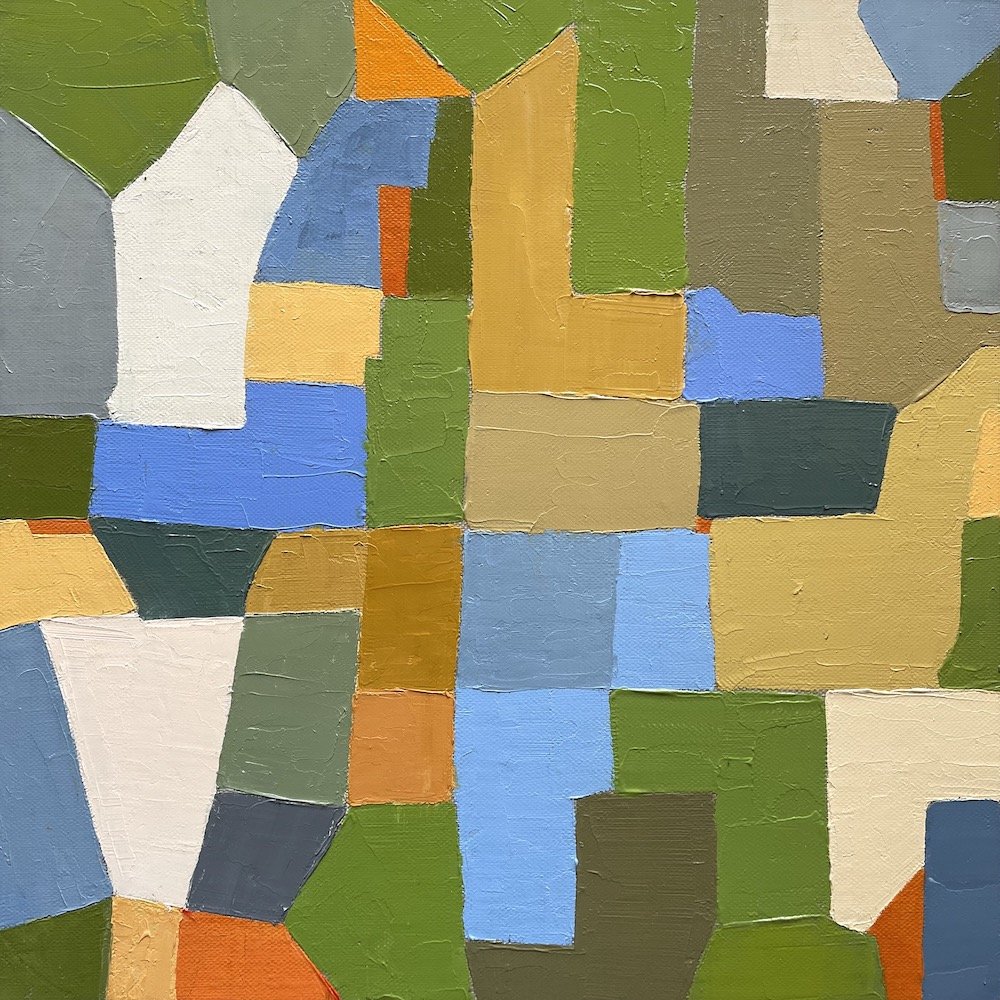
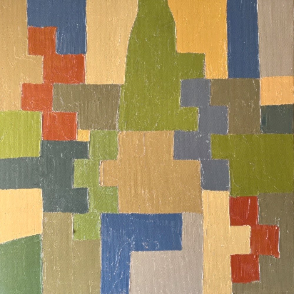
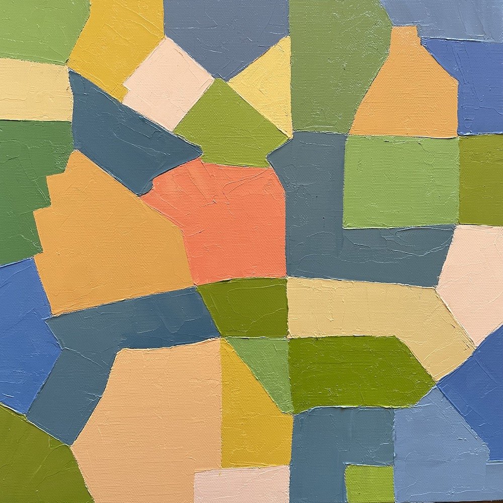
For me, painting is the interface or intermediate zone between the natural environment and the constructed world. The choice to focus on one or the other as a subject or inspiration is personal and not absolute. My education and practice as an architect for many years taught me critical observation and rigorous form giving abilities which I translate to a painted surface.
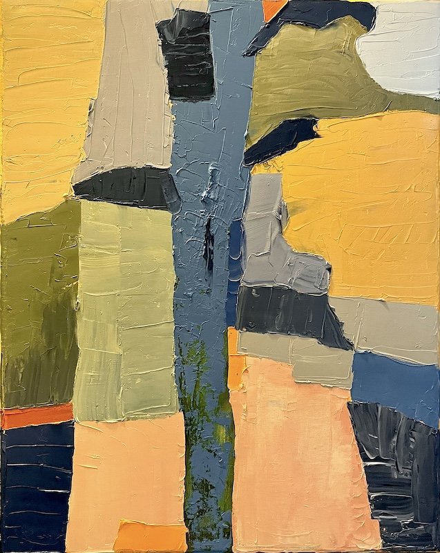
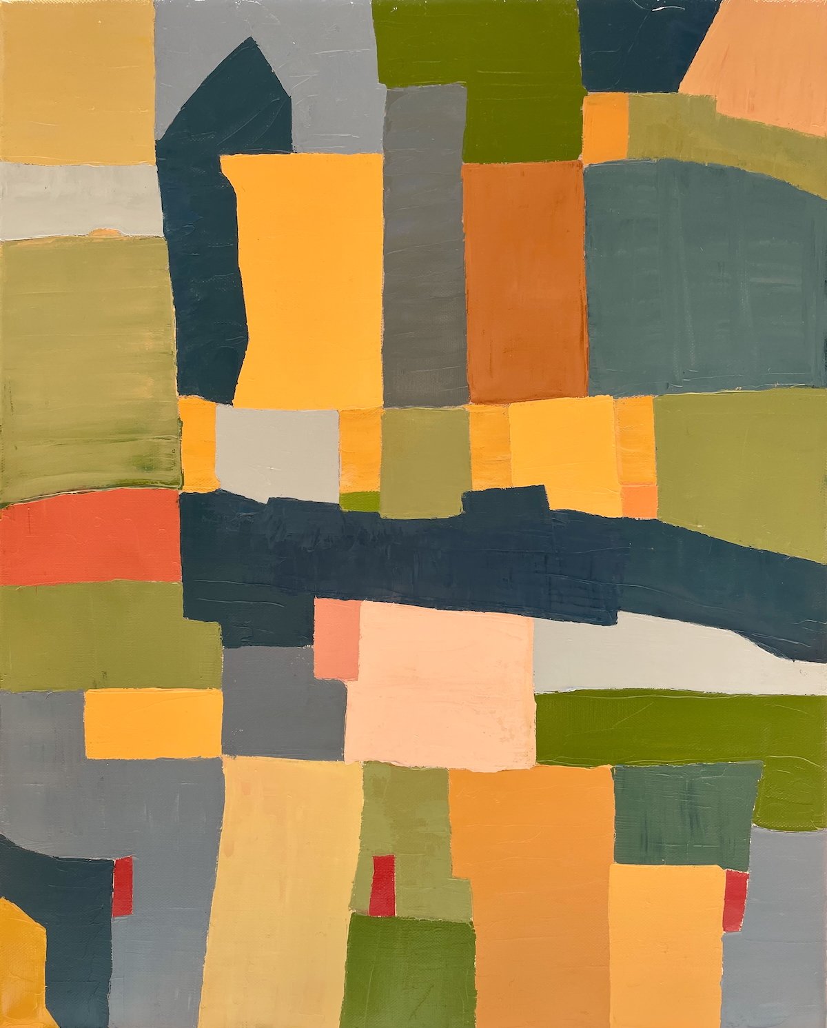
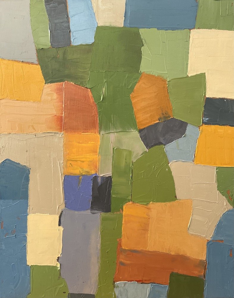
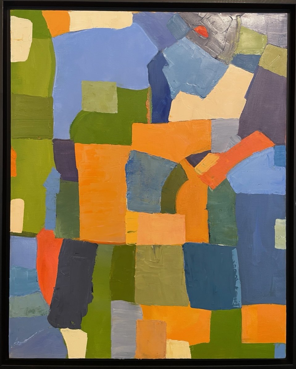
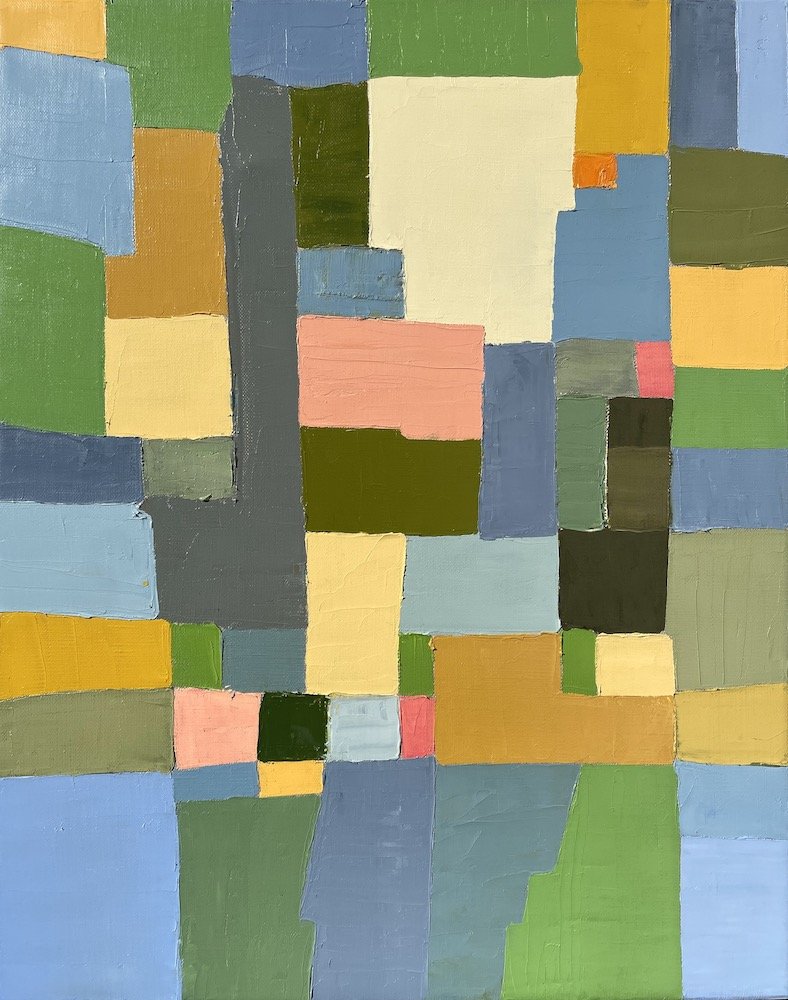
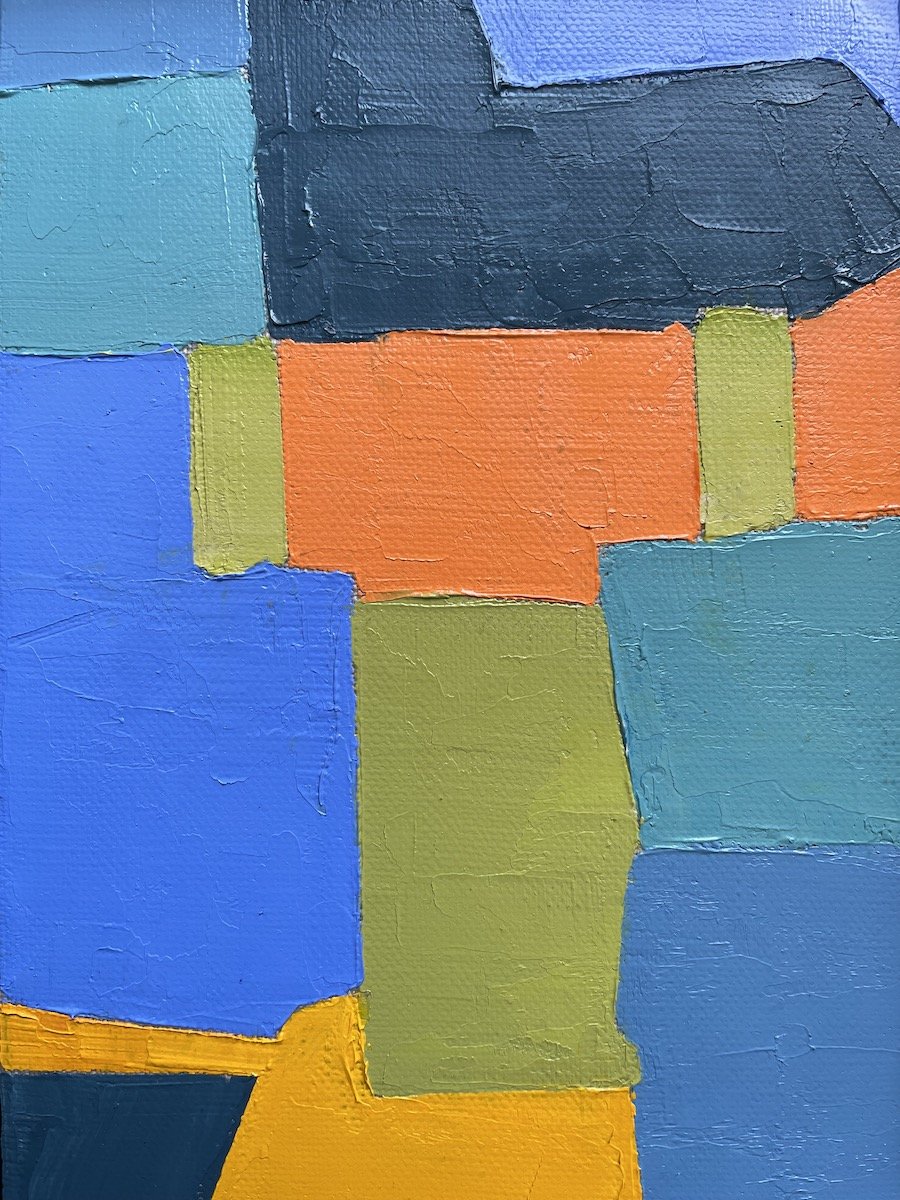
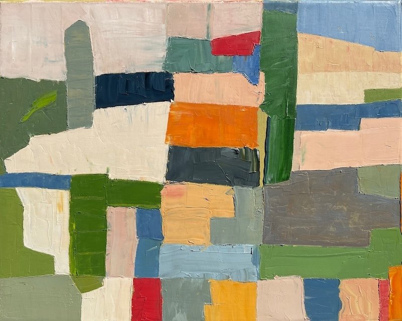
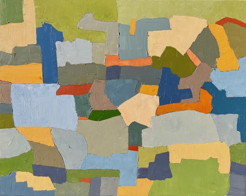
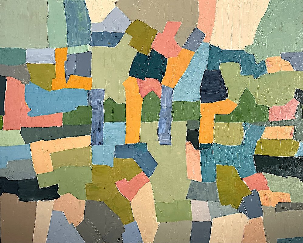
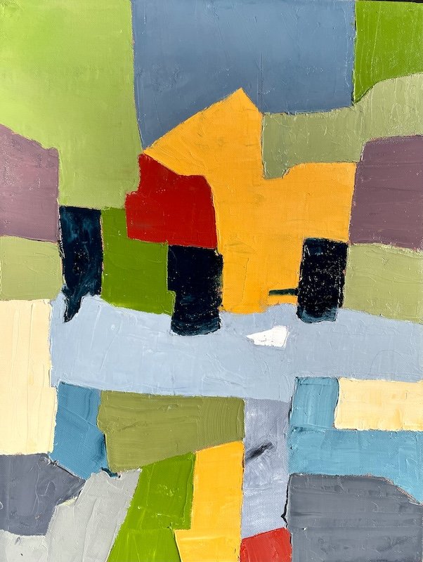
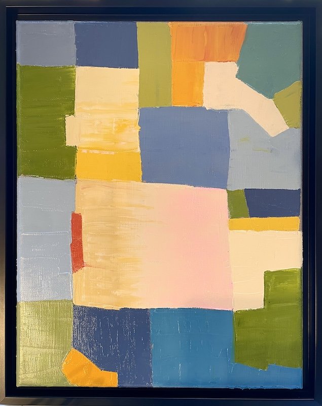
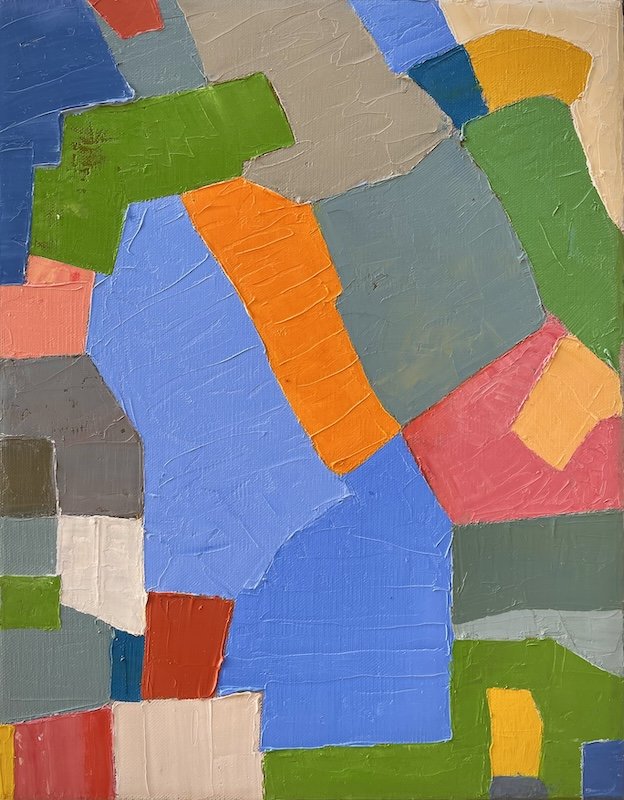
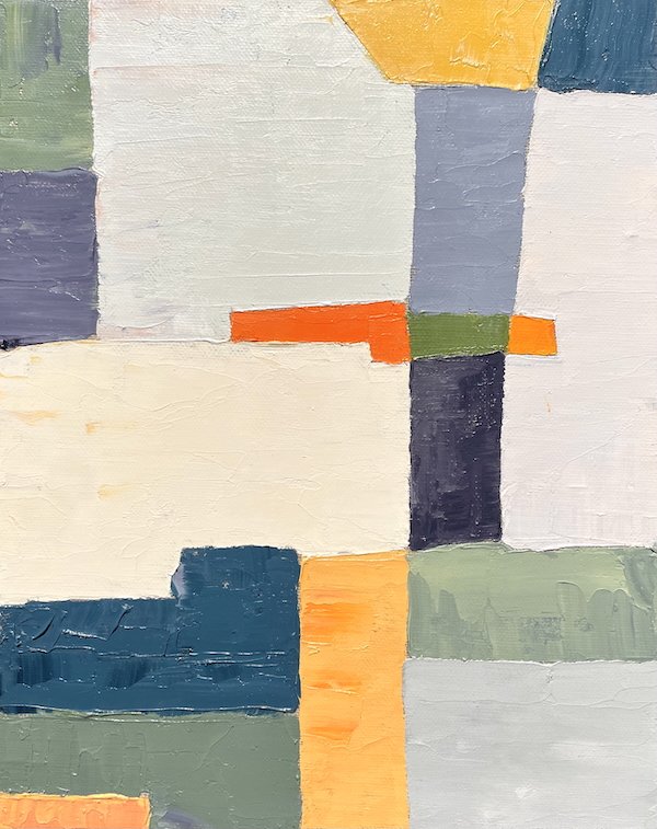
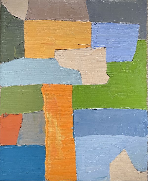
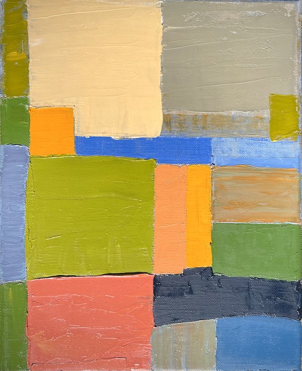
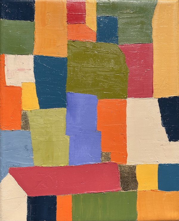
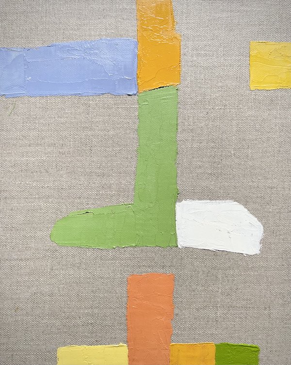
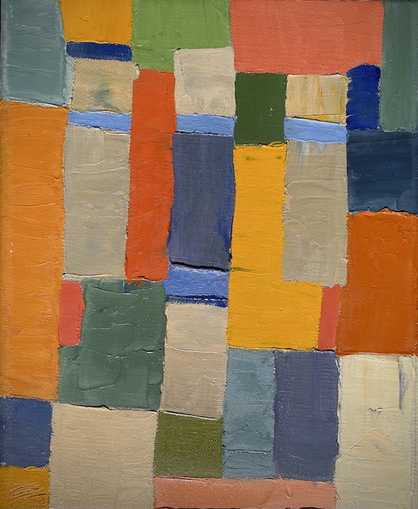
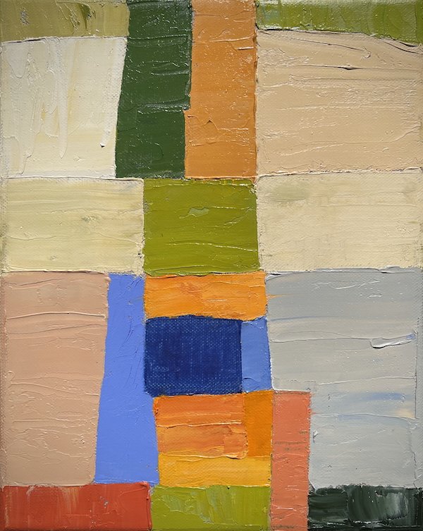
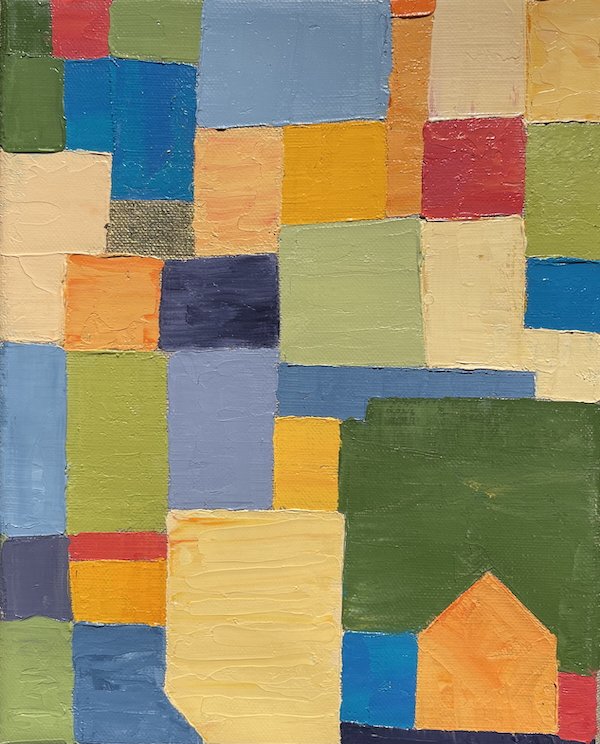
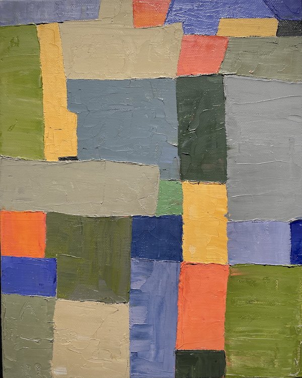
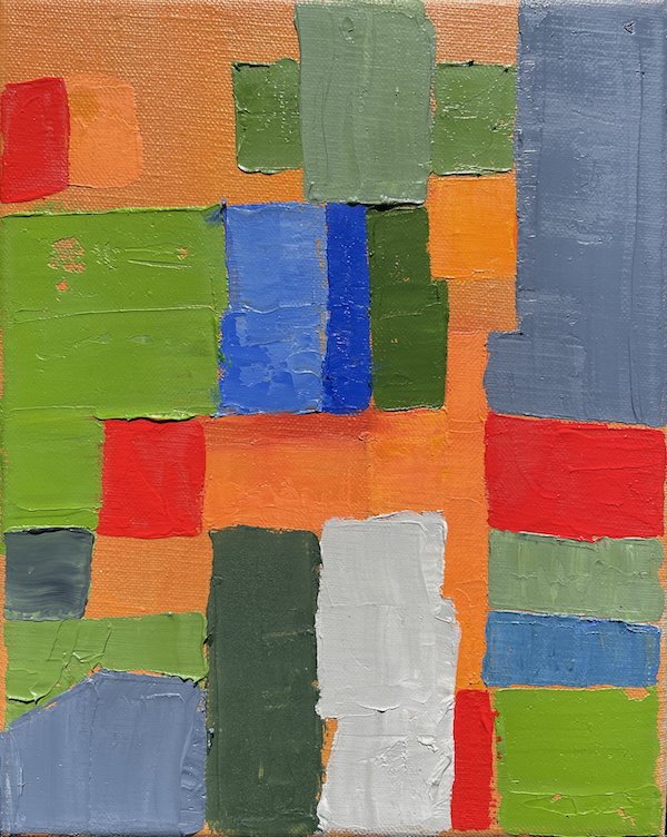
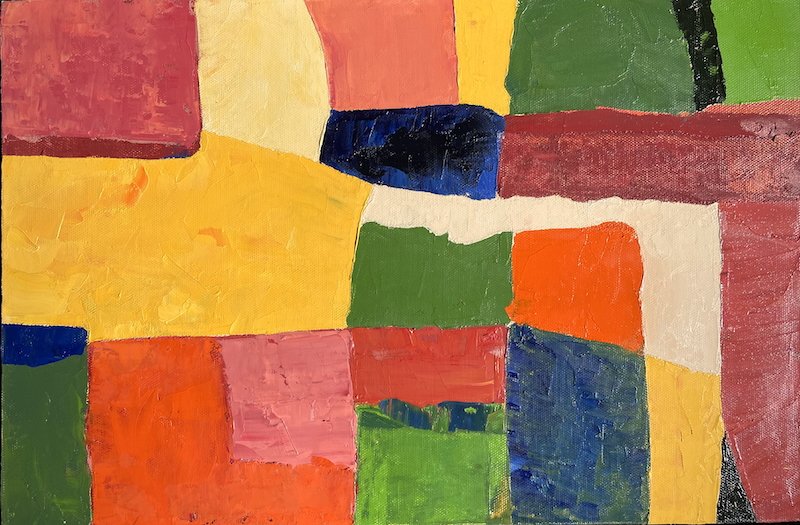
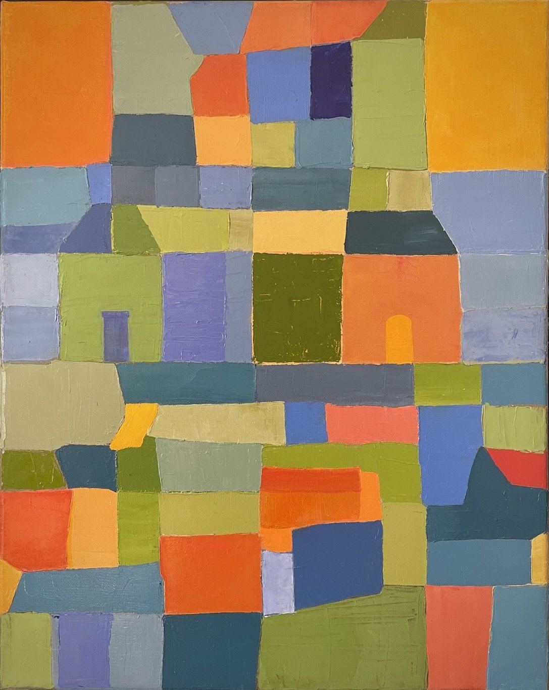
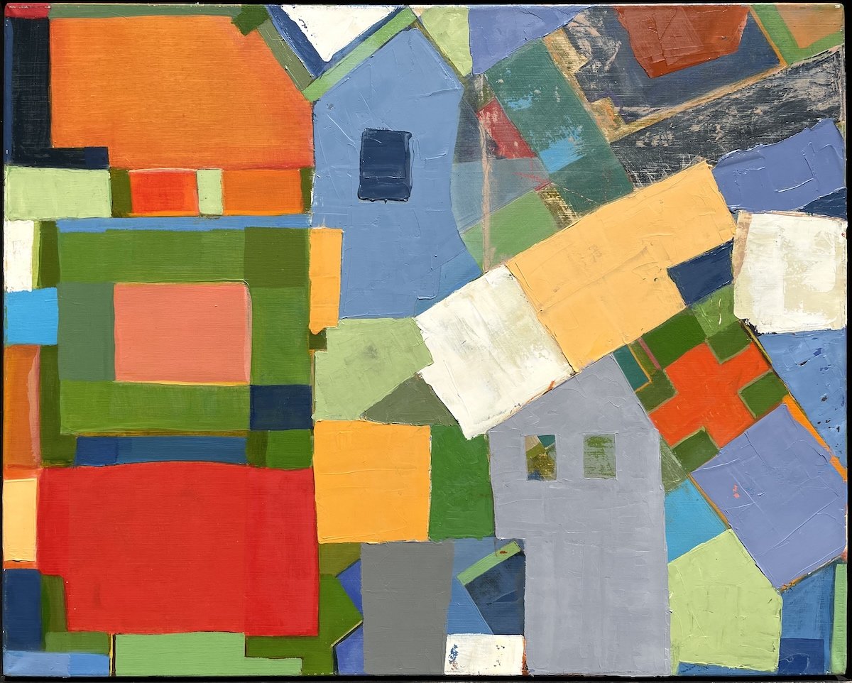
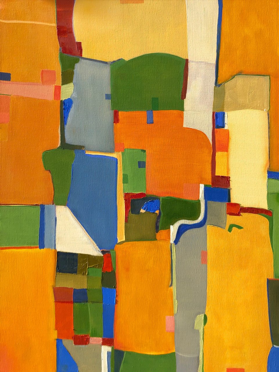
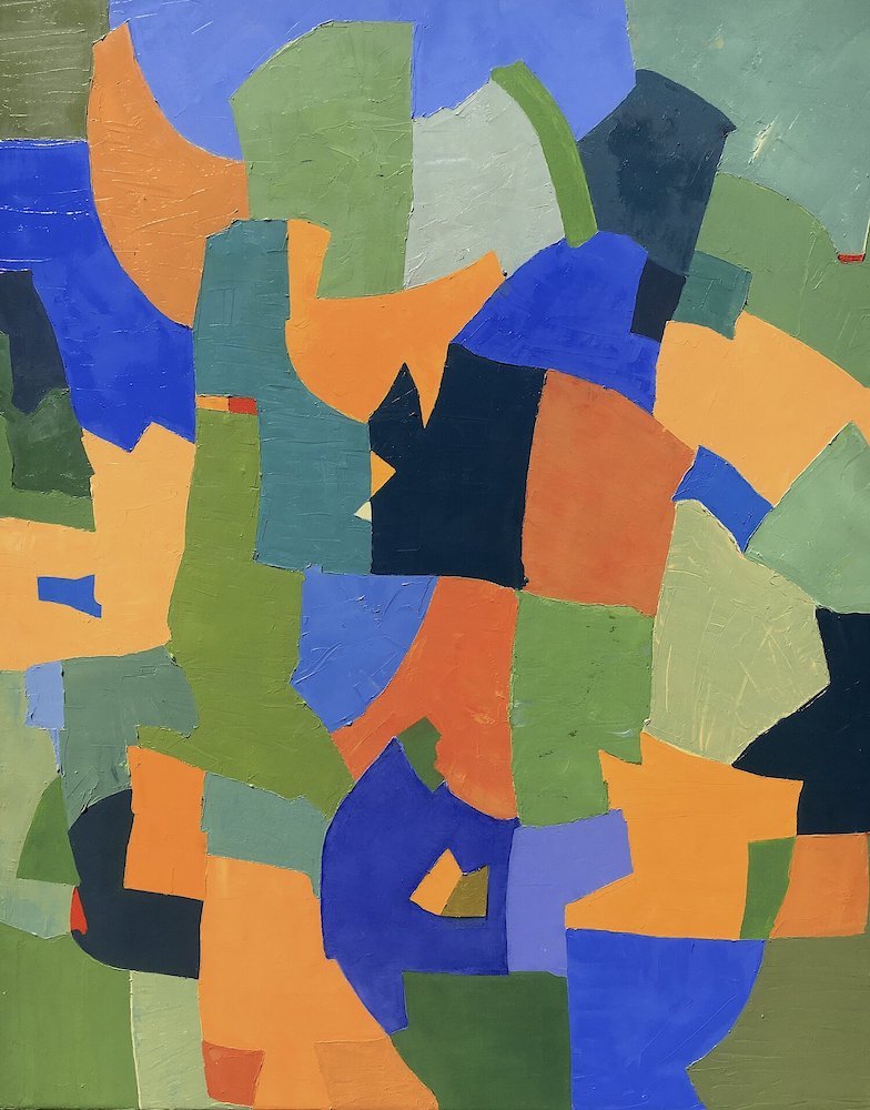
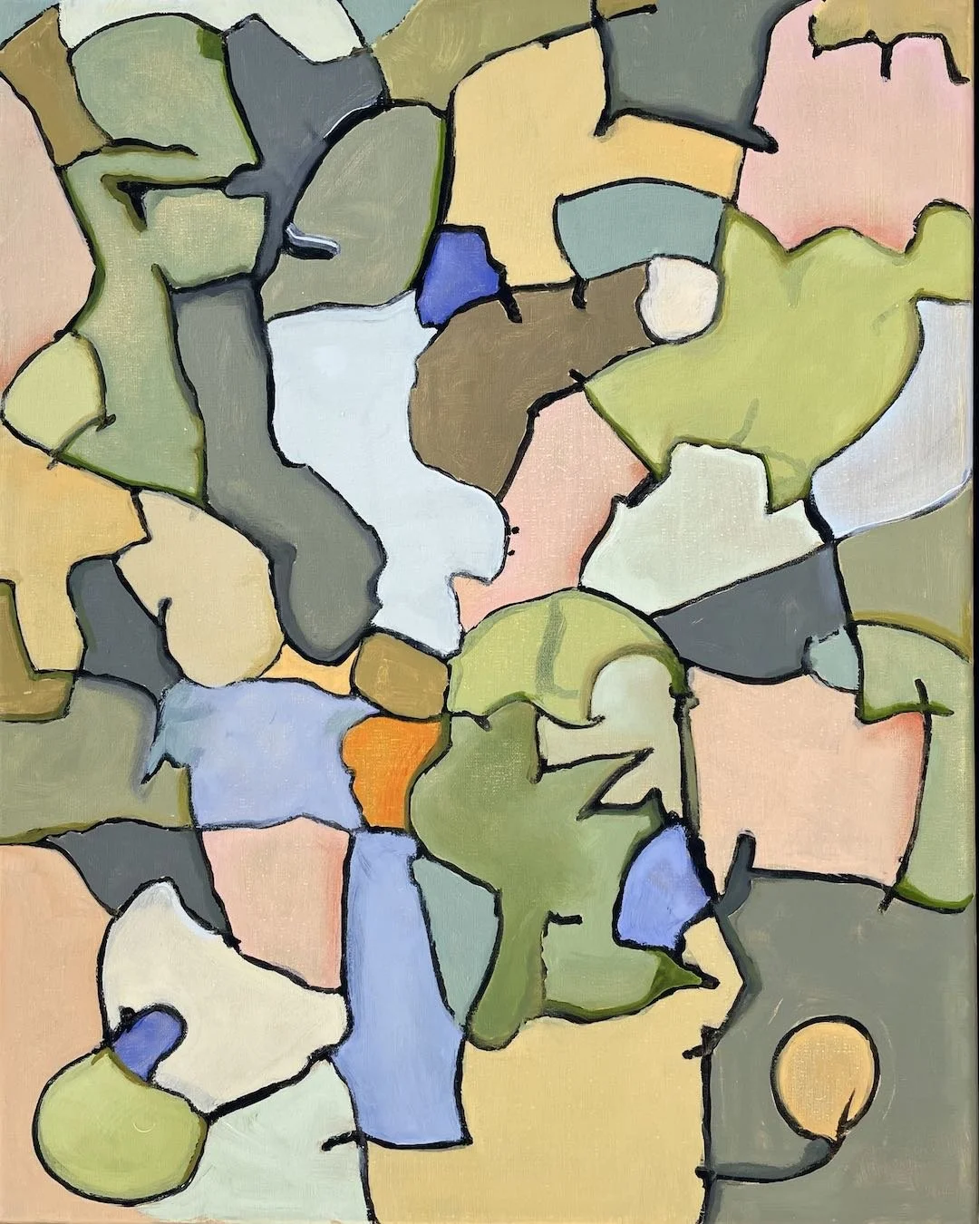
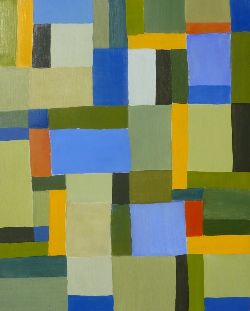
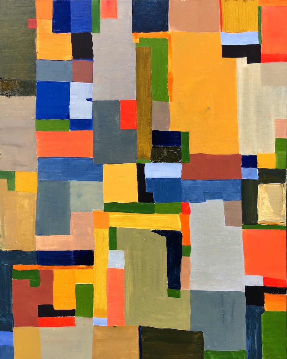
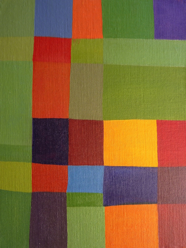
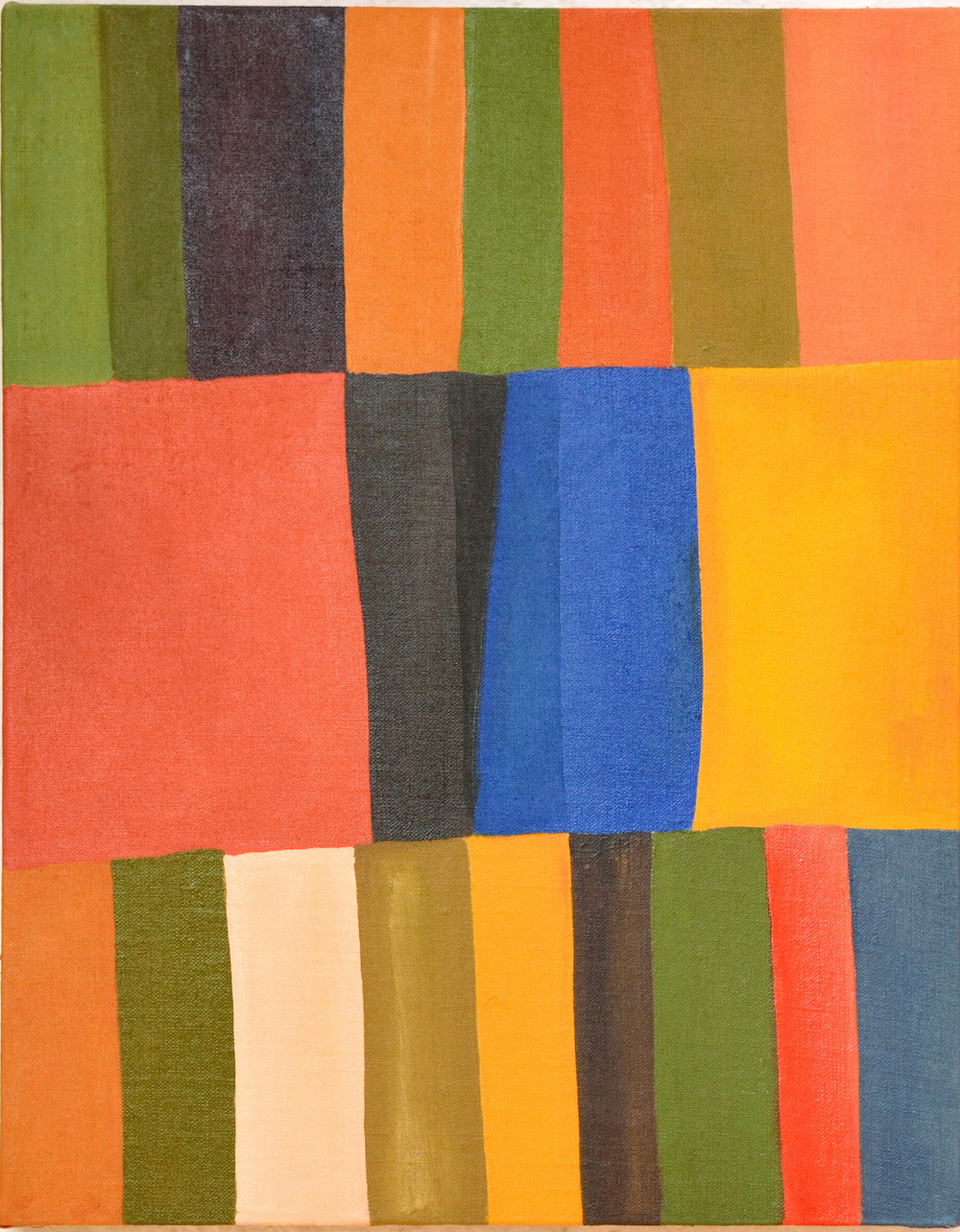
The paintings are constructed as they are being painted often with palette knives instead of brushes. The thick paint retains tool marks and the rough edges between colors is emphasized.
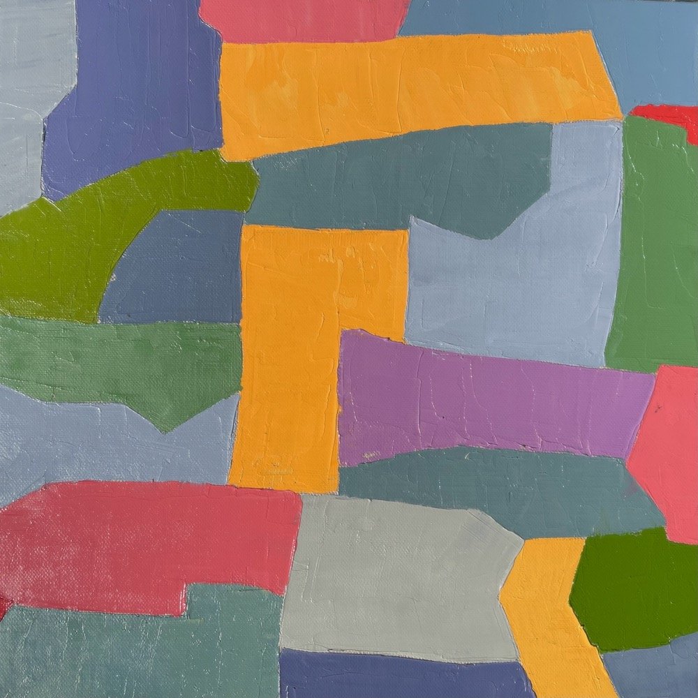
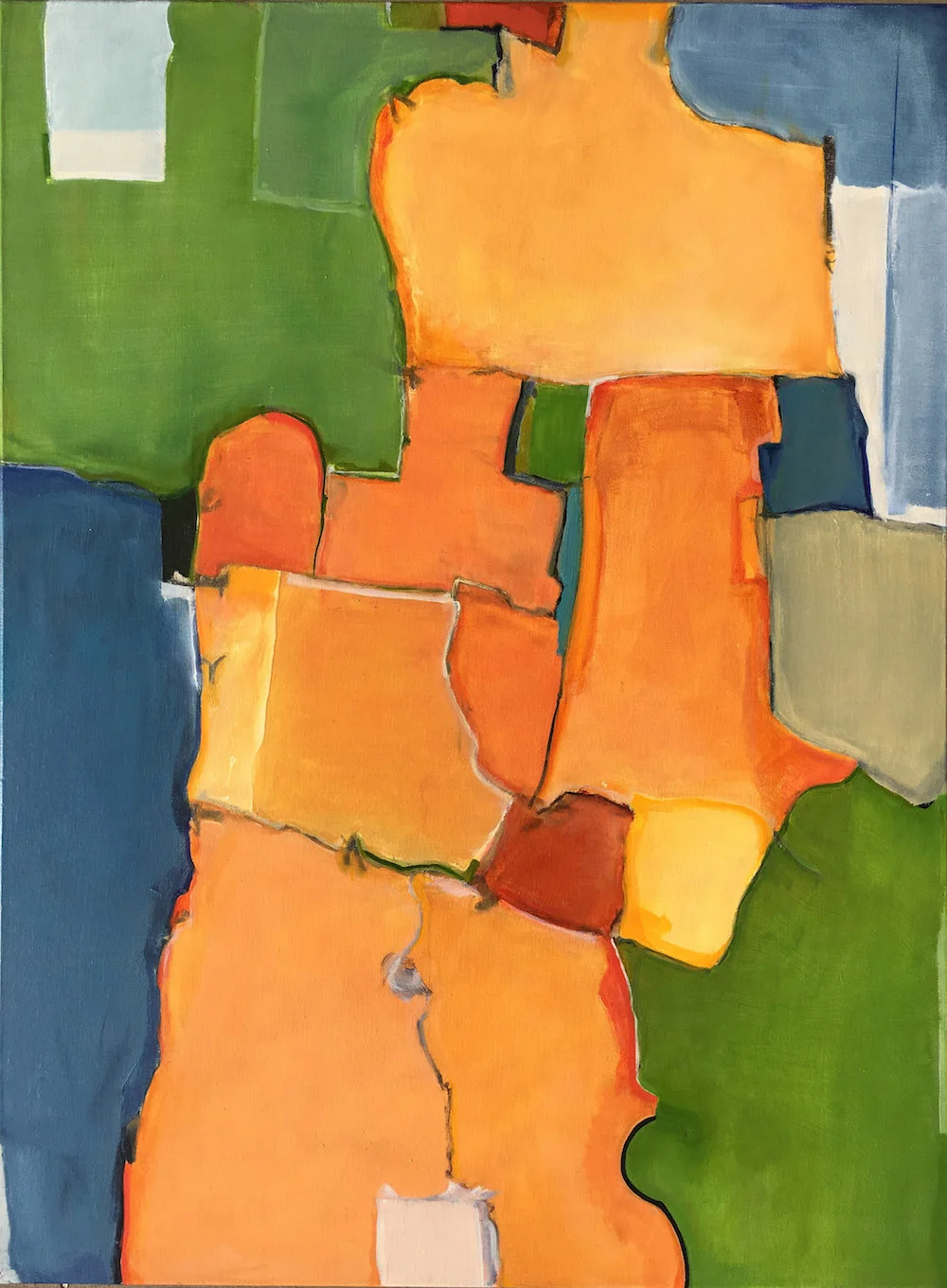
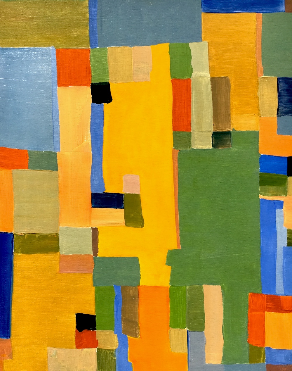
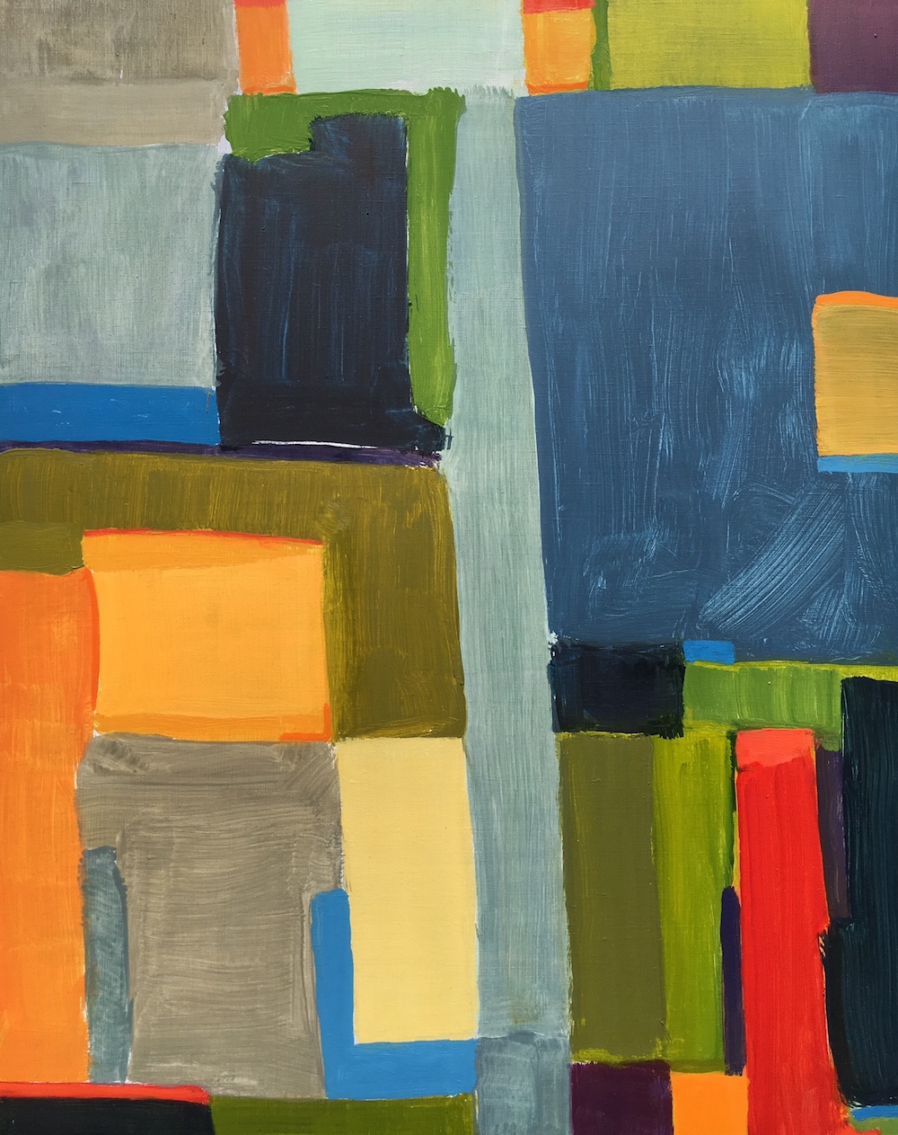
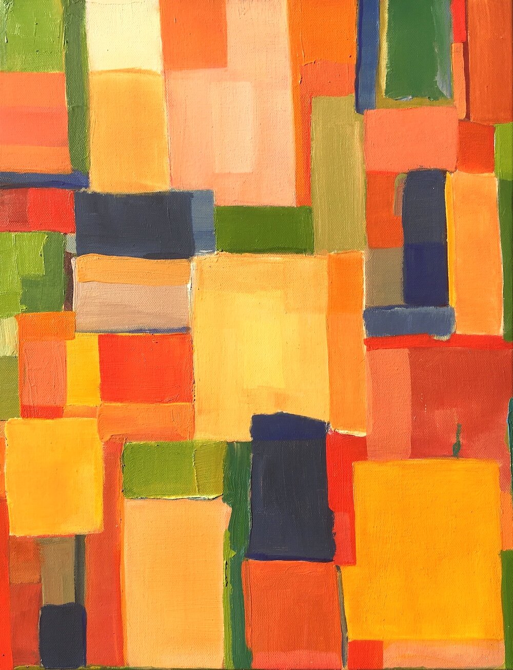
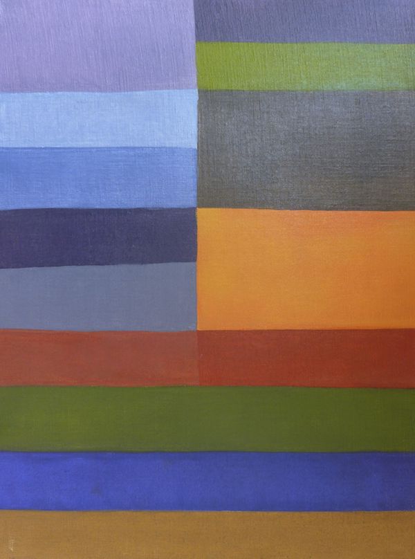
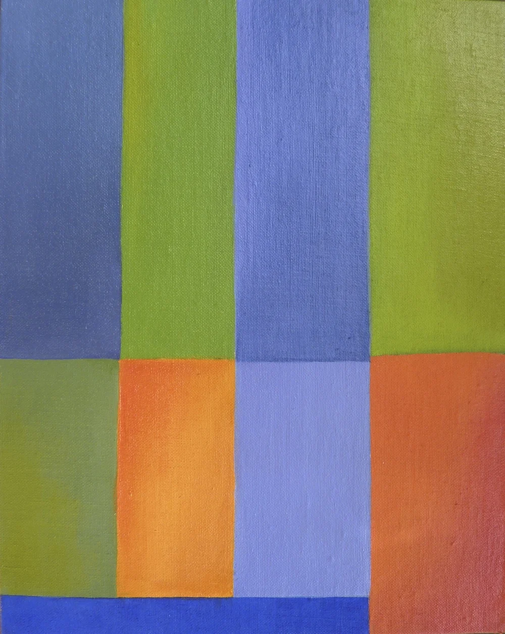
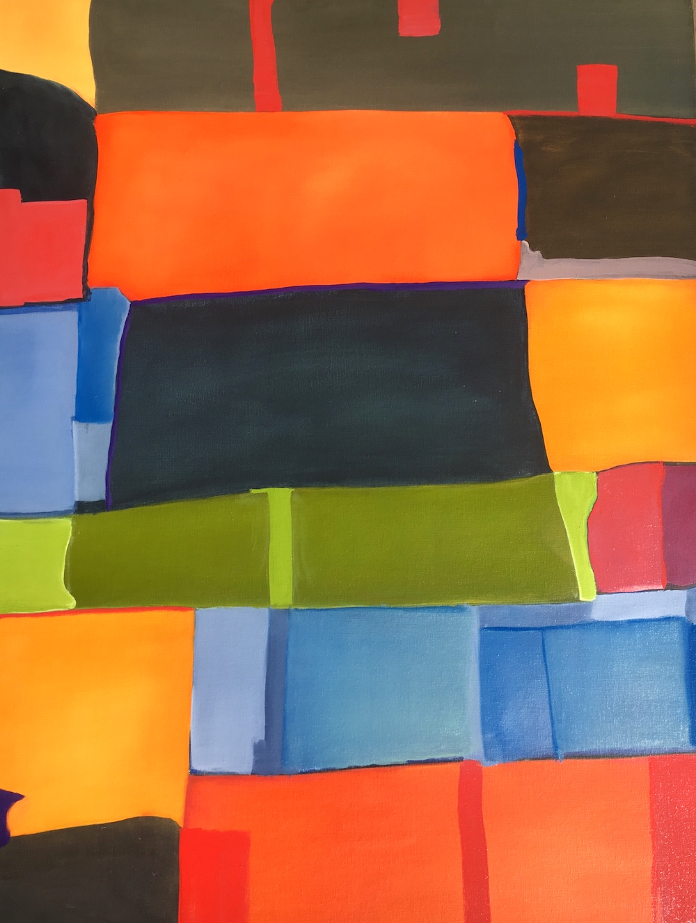
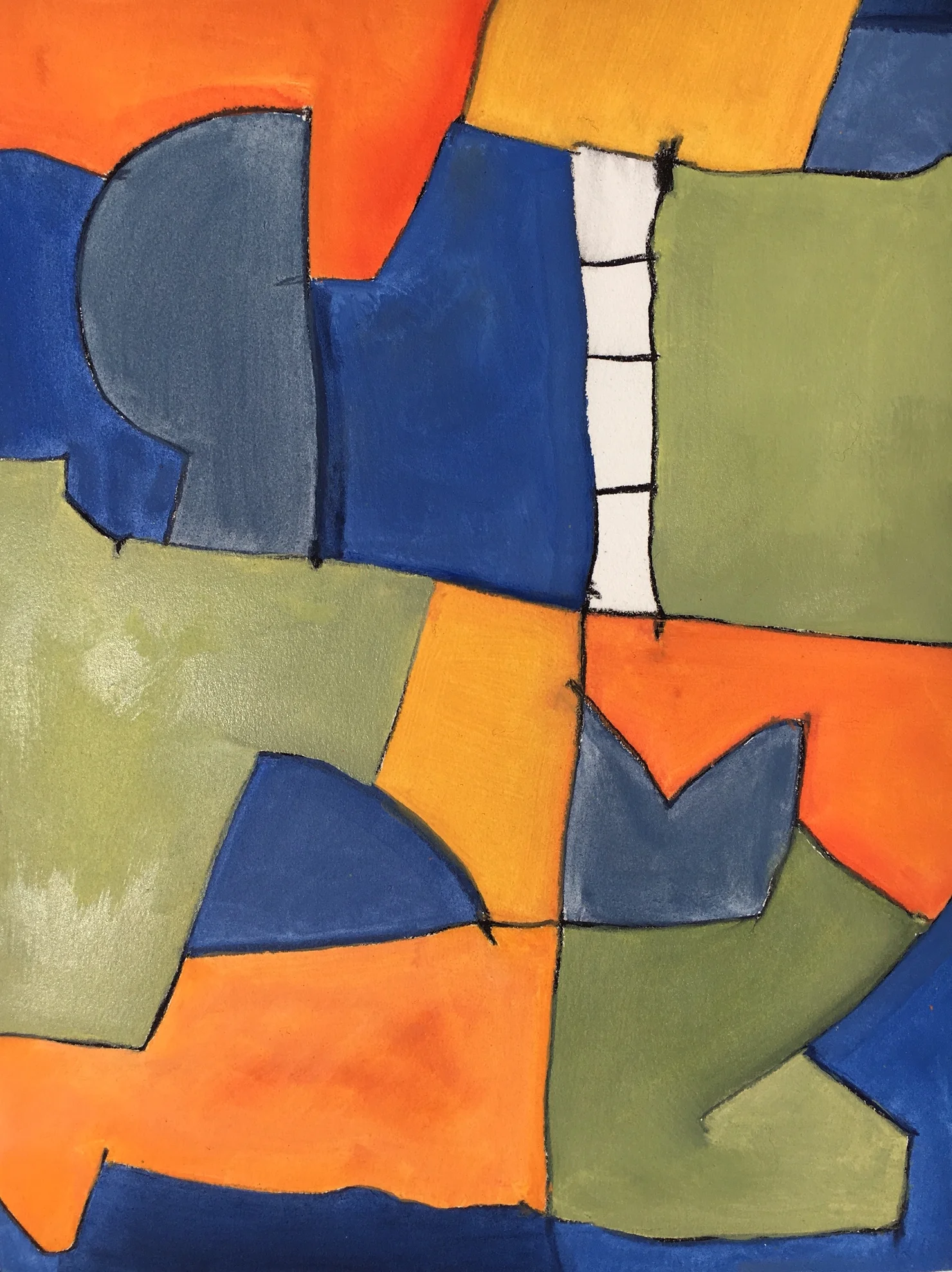
The color block paintings currently being produced are narrative neutral consisting of simple color/shapes on linen that play out parallel relationships distilled from a critical view of the built environment and from the ethereal spaces experienced in nature.
SELECTED FOR THE DE YOUNG MUSEUM OPEN EXHIBIT 2023
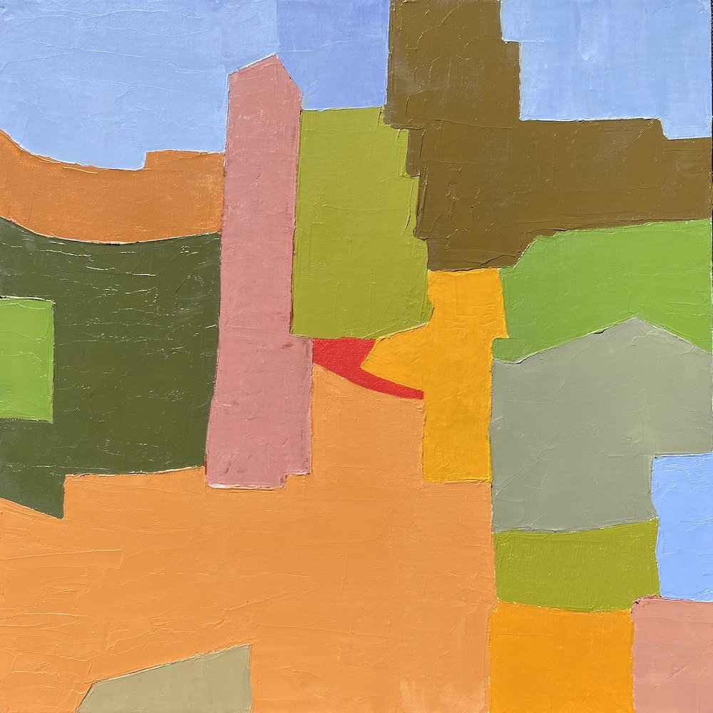
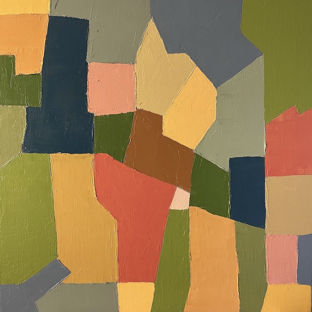
Working on smaller formatted supports presents unique challenges and opportunities. The scale invites close, intimate reading that brings the viewer into an intimate a space free from distraction and provides a potential personal relationship not unlike a iPad or phone. The portability of the small work allows placement on a table top or on the wall. Although these are final paintings, they also serve as studies or prototypes for enlarged transformations in the future.
-oil on linen 30”x24”. 2022-
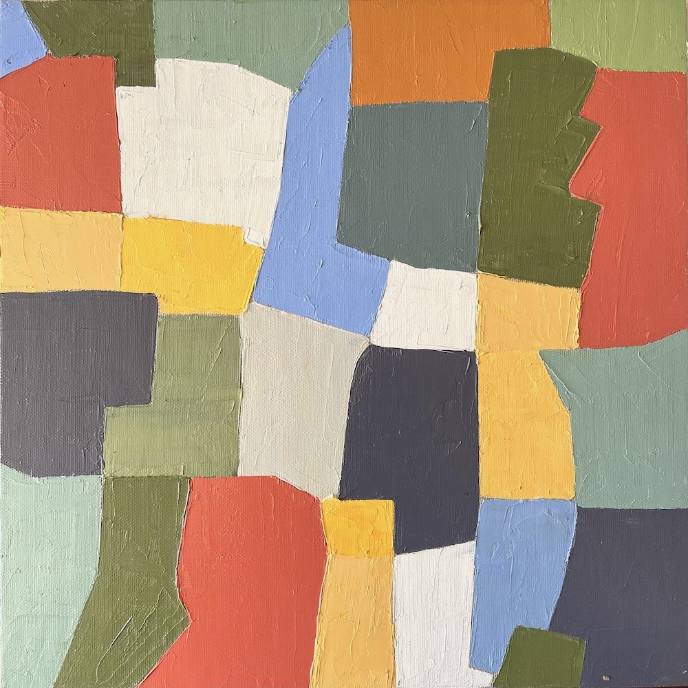
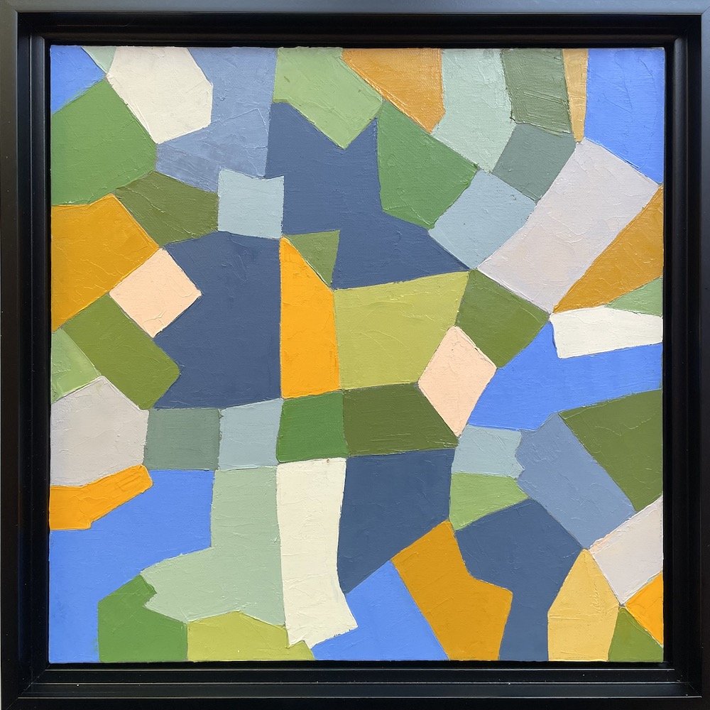
SQUARE DEAL series.
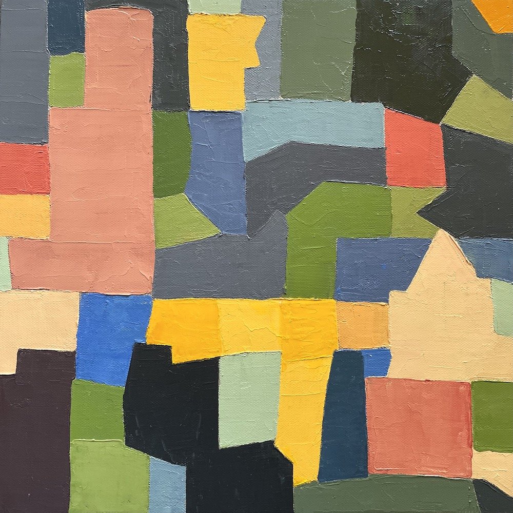
A square painting support has always presented special challenges due to the primary inherent geometry which is both static and familiar. This series plays with these constraints by breaking and dividing the space irregularity and making it more dynamic and energetic. The square shape is centered by nature of its equilateral shape but with the introduction of rouge vectors and discordant color combinations the center focus is replaced by action induced noise and visual dismemberment establishing a chaotic environment, resolved by asymmetrical balance and irregular counter movements. Although there is minimal evidence of recognizable elements there are imbedded simple shapes that reference buildings and natural forms.
The strong black frame acts as a containment facility to define the boundary of the painting and reinforce the squareness of the square that the irregular painted shapes set out to defile.
Conflict and resolution; a yin/yang intervention exercise for the mind and eye.
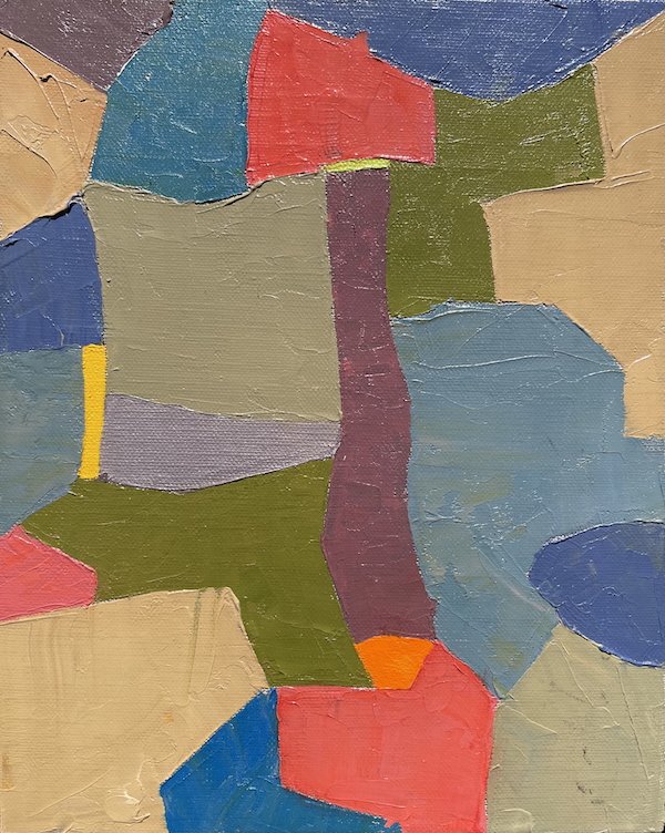
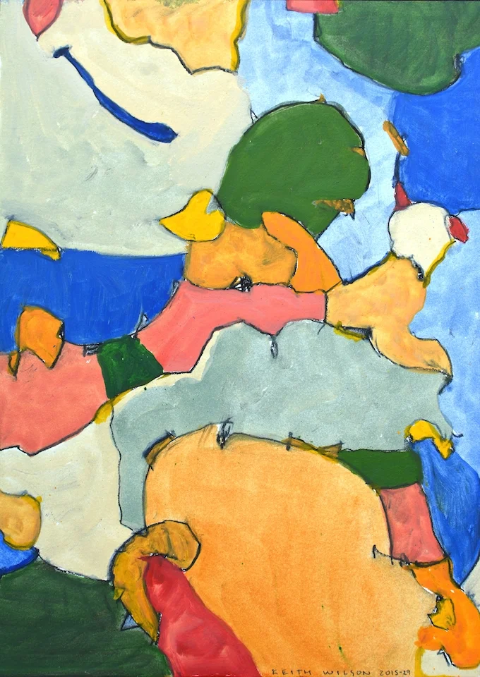
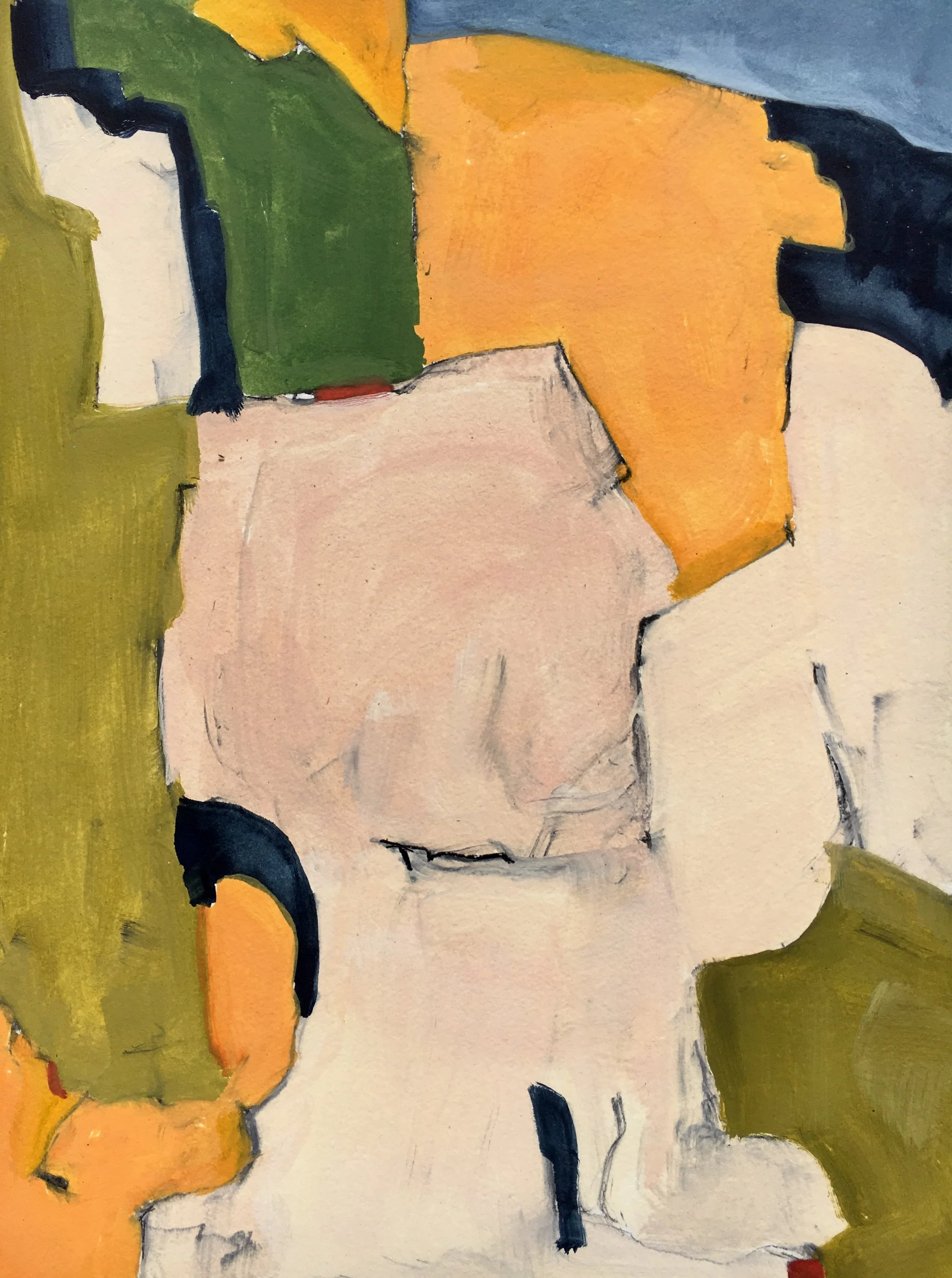
This continuing series of oil paintings are often generated by left-handed drawings that are non-referential but informed by natural forms and remembered spaces. Through an ongoing process of editing and modification they eventually morph into a cohesive organization of shapes.
KING OF LIMBS.01 -oil on raw/rough linen- 2020, 20”x16”
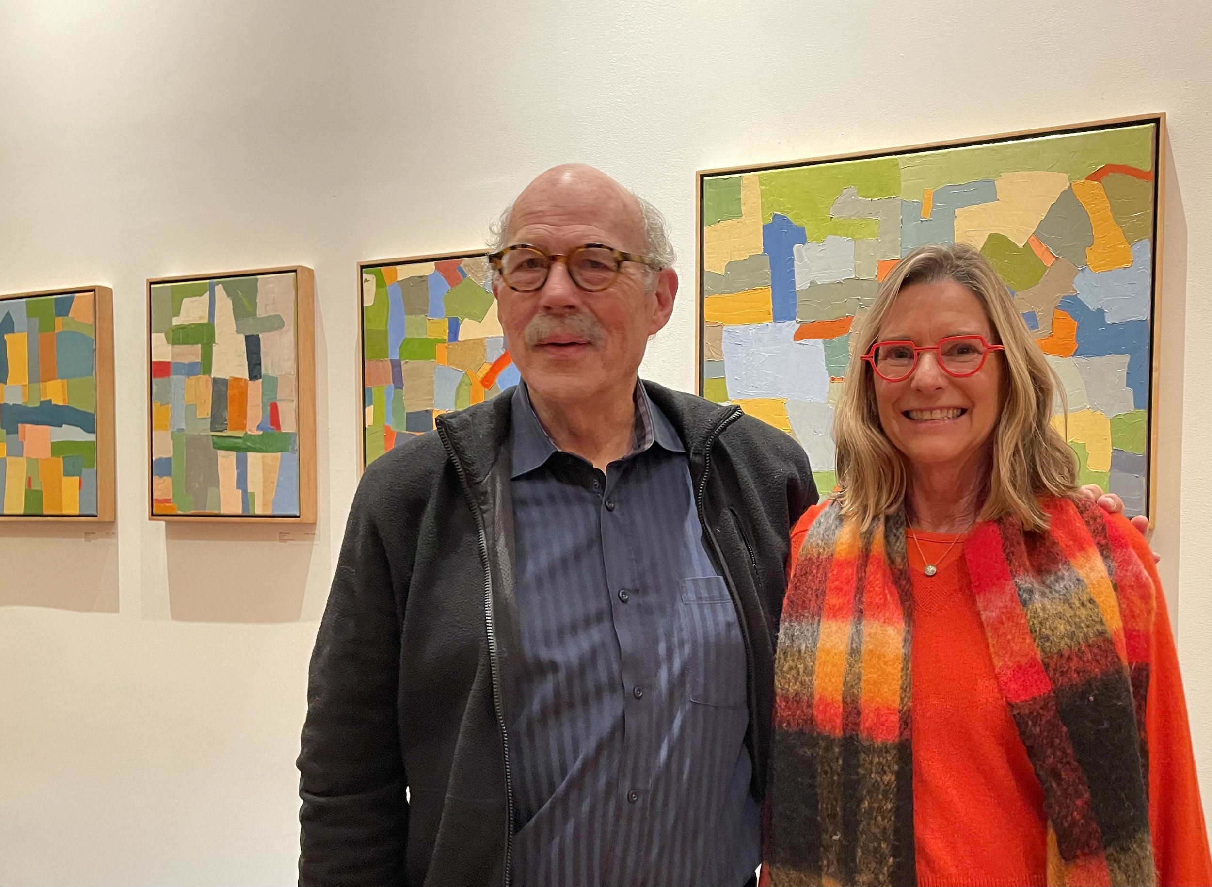
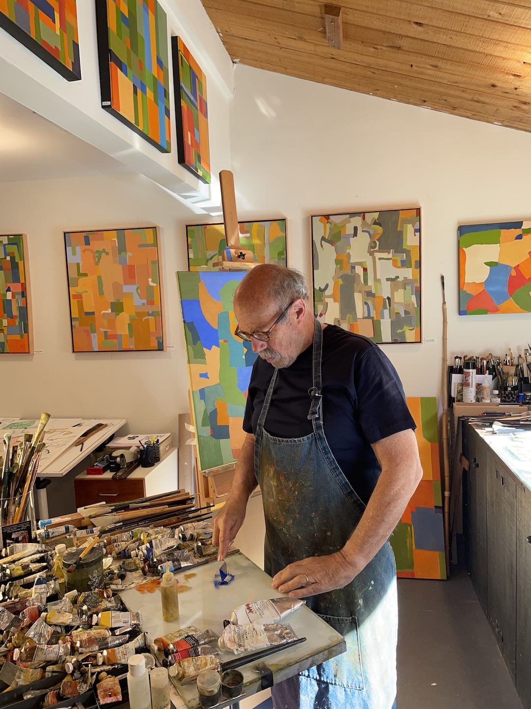
KEITH WILSON IN STUDIO AT THE SEA RANCH
Tales of Hofmann (Hans) -oil on linen- 2018 40"x30"
EASTER BECOMES AN ISLAND-oil on linen-2020, 30”x24”
POSITIVE RESPONSE -oil on linen- 2020, 30”x24”
DIS-PLACEMENTS-oil on linen-2018 30" x 40"
ON THE HORIZON -oil on prepared paper/mounted- 2020, 16”x12”
SANS TITLE -sumi ink/gesso on paper 16”x12”. 2021-
NEW ORDER -oil on linen- 2020, 30”x24”
BLUE MASS -oil on prepared paper/mounted- 2020, 16”x12”
GARGOLES -oil on linen- 2020, 30”x20”
I was a watercolor painter for over 35 years but I began painting with oil about ten years ago after viewing the Gerhard Richter exhibit at SFMOMA. I have no stylistic connection with his work but upon carefully observing his masterful use of oil paint I realize that I needed to change medium in order to increase the scale, presence and viability of my work if I was going to move forward and grow as a painter. It was a surprisingly difficult transition with all of my initial goals of simply translating my watercolors into oil paintings largely un-realizable to my satisfaction. I did however develop an unrelated direction that hopefully has the potential to produce substantive paintings.
READ MORE ON: CONVERSATION 8.Larger Oil Paintings
GreenSpace -oil on linen, 30”x24”- 2019
Dark Corners -oil on linen-2018 20" x 16"
MAIN EVENT -oil on linen- 2020, 30”x24”
Long Gray Corridor -oil on linen 30”x24”- 2016
First Light -oil on linen- 2019, 18”x14”
River Park -oil on gessoed panel- 2012
Pinkish Squared -oil on linen- 2020, 30”x24”
System of a Down -oil on linen- 2020, 40”x30”
NightFall -oil on linen- 2019 30”x24”
Lowered Horizons -oil on linen 2019-20”x16”
Summertime Blues -oil on linen- 2019 30”x24”
Large Pool House-oil on linen-2016, 40" x 30"
Dark Energy -oil on linen- 2020, 30”x24”
Yellow Ledbetter -oil on linen, 30"x40" 2016-
Blue Streak -oil on linen- 2013/17
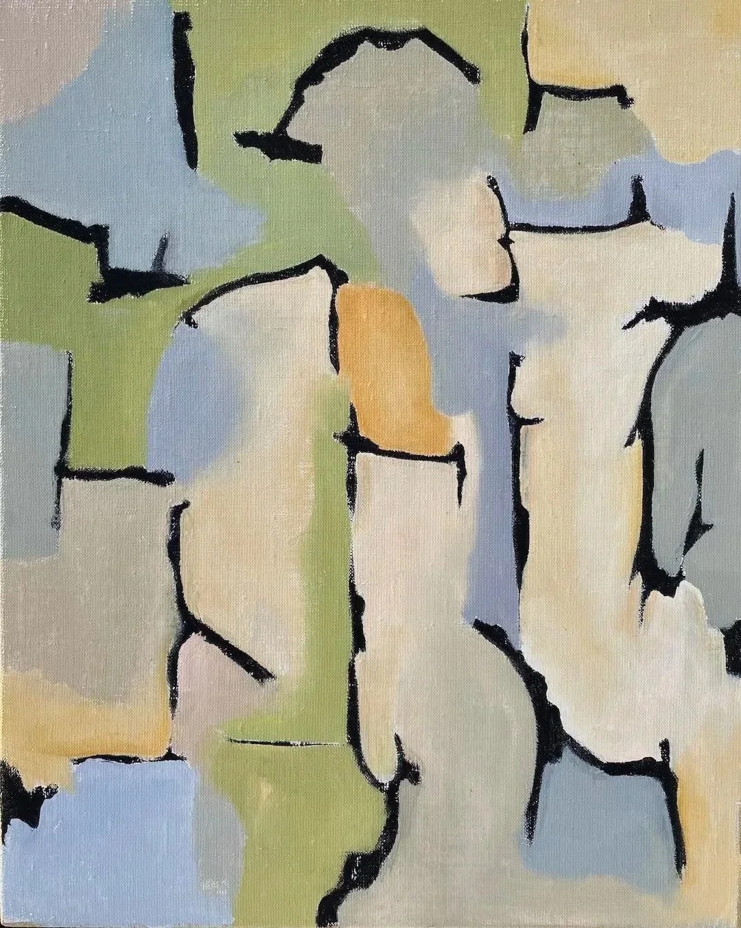
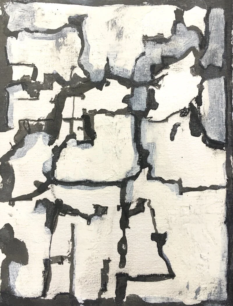
The primary act of drawing on paper energizes this current series. The provided structure is an armature that can be transformed into an edge, shape or remain an enhanced linear element.
Dense color blocks are interlocked with transparent amorphous cascading shapes all generated by the initial fugitive vine charcoal marks. The dominance of the line recedes as it is merged with the paint and amplifies the edges of the pictorial elements.
Similar to the PURE PAINTINGS, the painting alone is the subject/object. However, unintended visual elements have emerged, often upon rotation, producing partially recognizable features or objects to some.
These works are thinned oil paint on Arches Oil Prepared paper mounted on cradled panels. The sizes are mostly 12”x16” and 9”x12”.
READ MORE ON: CONVERSATION 3.Painted Drawings
INDIGO FALLS-Painted Drawing.05 -oil on paper- 2016
ATTEMPTED ORDER- Painted Building Plan.264 -oil on paper- 2016
BLUE MASS -oil on prepared paper- 2017
Painted Drawing.03 -oil on prepared paper- 2015
Painted Drawing.41 FOUR CORNERS -oil on paper/mounted- 2015
Painted Drawing.21 BLUE EMBRYO -oil on paper/mounted- 2015
Painted Drawing.39 -oil on paper- 2015
AC.52 GHOST HOUSE -oil on prepared paper/mounted- 2015
This extended series of paintings started from a simple brush-out of color on a scrap of linen. My primary interest is to create a series of Pure Paintings which develop from a directed focus and response to the support, pigments and tools. I am attempting to create paintings that are embedded with a familiar aura or mnemonic coding but are narrative neutral, self contained and free from reference to commercial, social or manufactured influences.
READ MORE ON: CONVERSATION 1.Pure Painting Series
ColorSpace -oil on linen- 2016
CapturedThought -oil on linen- 2013
Balance Point -oil on linen- 2014
Down Shift -oil on linen- 2014
Green Squares Opposed -oil on linen- 2013
Resolution -oil on linen- 2013
Test Pattern -oil on linen- 2014
Color Fields-oil on vintage Fortuny fabric- 2016
Indigo Corner -oil on linen- 2013
Strata Study, ref. P. Klee -oil on linen- 2013
Curvature of the Spline -oil on linen- 2013
The Presence of Absence -oil on linen- 2013
Growth Factors -oil on linen- 2014
Inner Sanctum -w.c.- 2008
Support Network -oil on linen- 2018 40"x30"
Fifteen years after discontinuing the practice of architecture, building plans have drifted into my paintings.
Thickened lines recalling walls and openings establish the enclosure of spaces and framing of light and views and establish the metrics of habitation and containment. Additional forms and marks are present, defining the site and addressing the placement of buildings and ancillary structures.
Architectural plan elements complicate the effort to seek purity in the paintings. They produce a readable, scalable event and a reference to dimensional habitable space. They assign a degree function to paintings which are resigned to being without purpose or actual usefulness.
The suggestion of building plans and site improvements in a non-objective painting directly violated the concept of abstraction in a real and symbolic fashion.
Meanwhile the elements of building plans have entered into my paintings possible as a reference to my previous profession or perhaps as nostalgia for a fading and disappearing mode of communication and construction. WTF.
This collection of more than 50 paintings was exhibited recently as a solo exhibit entitled "The Building Plan Artistically Considered" as a reference to the late 19th century essay by Louis Sullivan.
READ MORE ON: CONVERSATION 4.Painted Buildings
Emerging Building 2014 -oil on paper
Random House -oil on paper- 2016
Painted Plan.137 Meadow House -oil on paper- 2016
Pool House -oil on paper- 2015 11" x 13"
Yellow Atrium -oil on prepared paper- 2015
House Divided -oil on prepared paper- 2016
Painted Plan.17 Industrial Site -oil on paper- 2015
Painted Plan.109 Central Space -oil on paper- 2015
Painted Plan.09 Random Layout -oil on paper -2015
Painted Plan.11 Baroque Park -oil on paper- 2015
Painted Building Plan.107 Offset Entry -oil on paper- 2015
Painted Building Plan.201 Hidden Room Plan -oil on paper- 2015
Painted Plan.04 Renovation -oil on paper- 2015
Loft Access -oil on paper- 2016
Watching the SLA Shootout on TV. -w.c.- 1978
ARCHITECTURAL WORLD -copperplate etching- edition of 48 plate prepared/proofed in 1981. Edition printed by KALA Institute 2016 from plates that were recently located.
A TALE OF THREE CITIES/ONE -copperplate etching- edition of 48 Plate prepared/proofed in 1981. Edition printed by KALA Institute 2016 from plates that were recently located.